To learn how to make layout blocks and elements dynamic, and how to edit, duplicate, or delete block content, read Customizing Layout Blocks in Emails.
If you're using the new email editor, read Overview of the New Email Editor instead.
| Administrators | ✓ | |
| Company Managers | ✓ | |
| Marketing Managers | ✓ | |
| Sales Managers | ||
| Salespersons | ||
| Jr. Salespersons |
 | Tip: Are you looking for information about Constant Contact’s Email and Digital Marketing product? This article is for Constant Contact’s Lead Gen & CRM product. Head on over to the Email and Digital Marketing articles by clicking here. Not sure what the difference is? Read this article. |
Creating marketing emails has never been quicker. Produce beautiful marketing emails in minutes. Launch campaigns on the fly with out-of-the-box, professionally designed templates.
Start from an email template in the Email section, of the left toolbar. Read Creating Emails from Templates to learn how.
To edit emails, start from the Email page in the left toolbar.
 Edit Email.
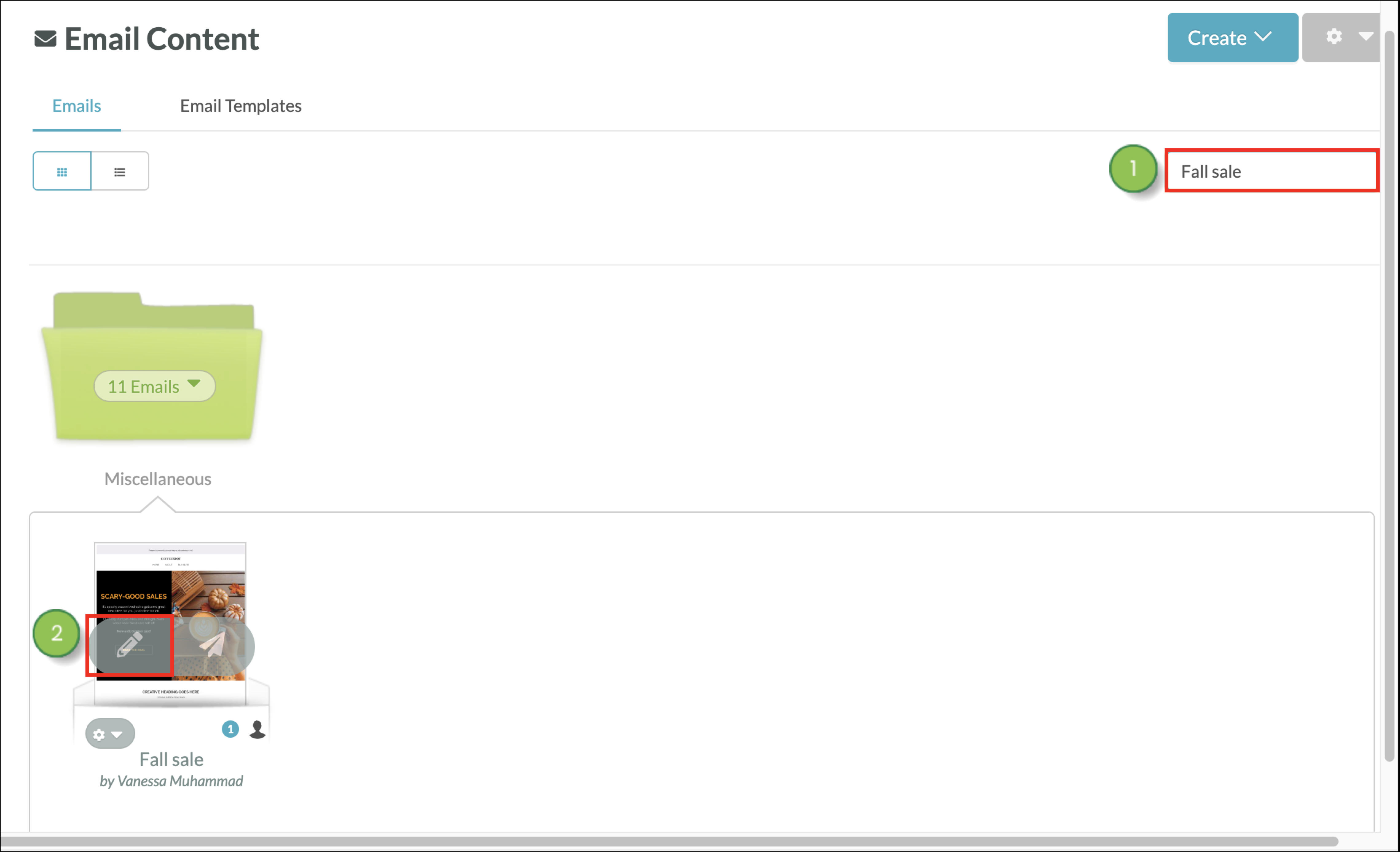
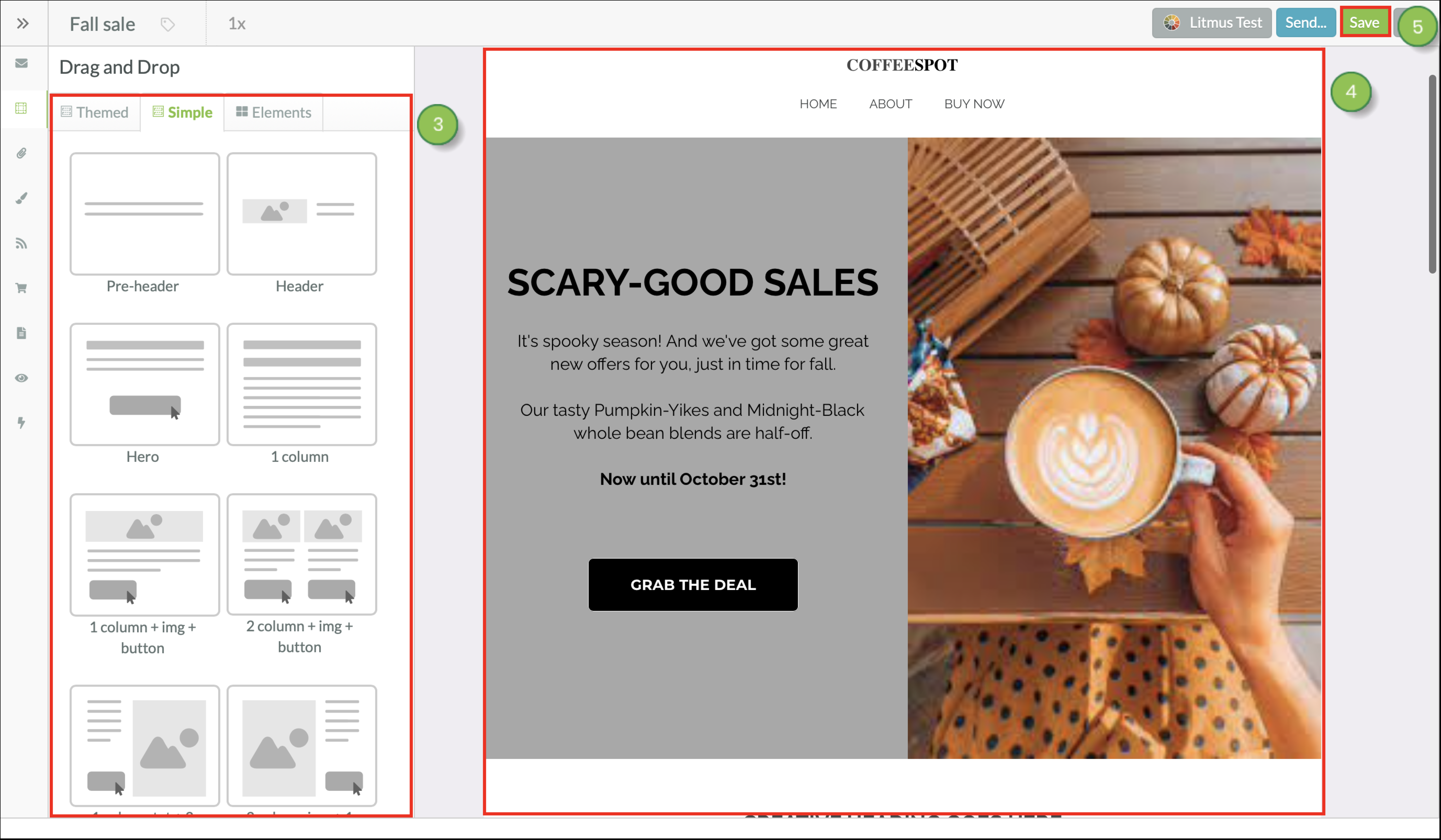
The  Content and Layout panel provides several different kinds of customizable blocks for your emails. This panel allows you to access the drag-and-drop function of the email designer. Themed layouts, simple content blocks, and individual content elements are all able to be placed into an email.
Once placed in the email, the content blocks can be customized as needed by using the available features found in the Content Editor.
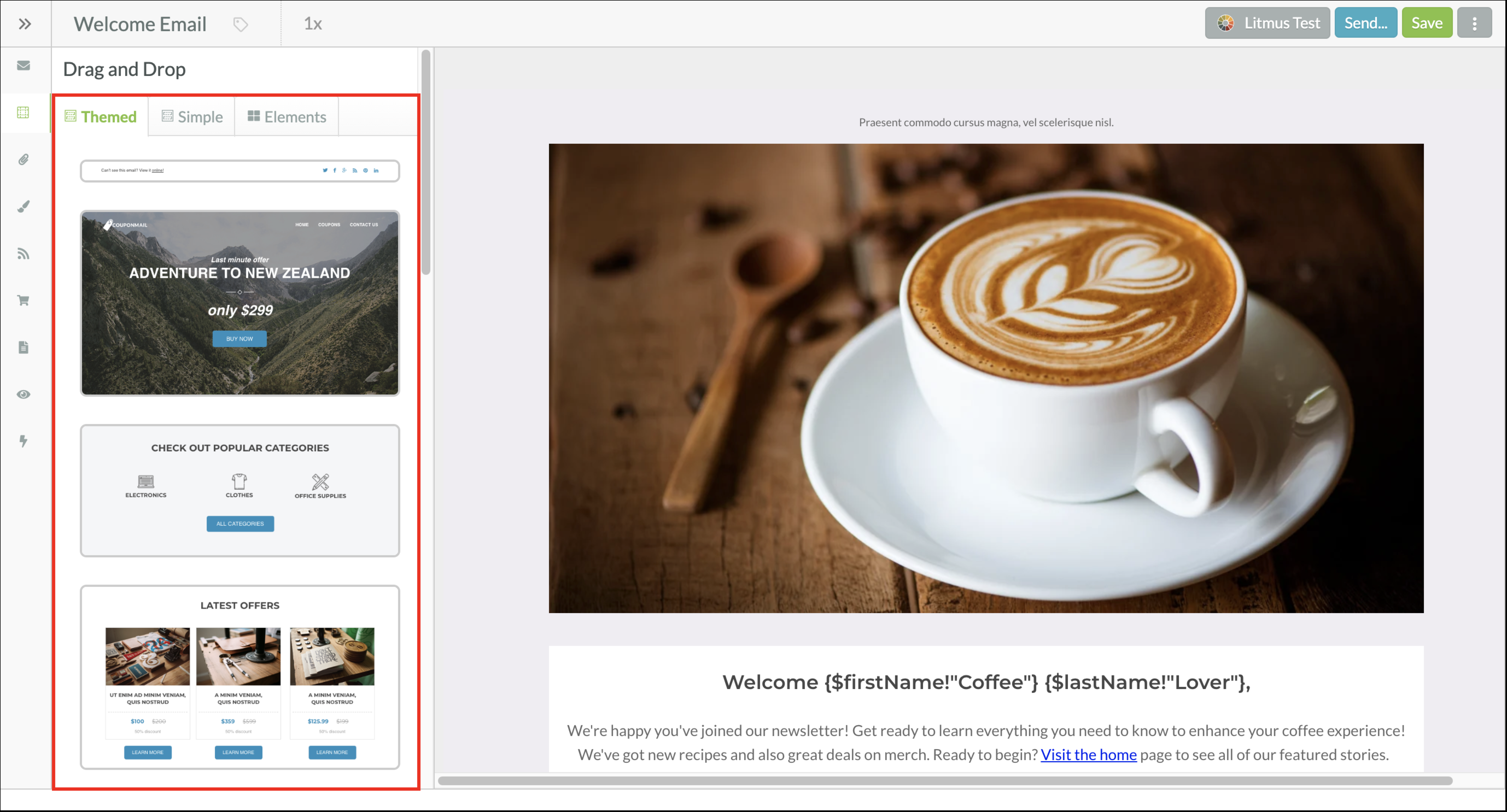
Themed Blocks
Layouts in the  Themed tab are pre-built sections that are used to hold various content blocks. They can be dragged and dropped or reordered in emails.
Content blocks in the  Simple tab are pre-built layouts with simple, generic visual structures that can be dragged and dropped into layout sections in the email designer. Layout blocks cannot be nested. This means you cannot put a layout block inside of another layout block, only above or below one.
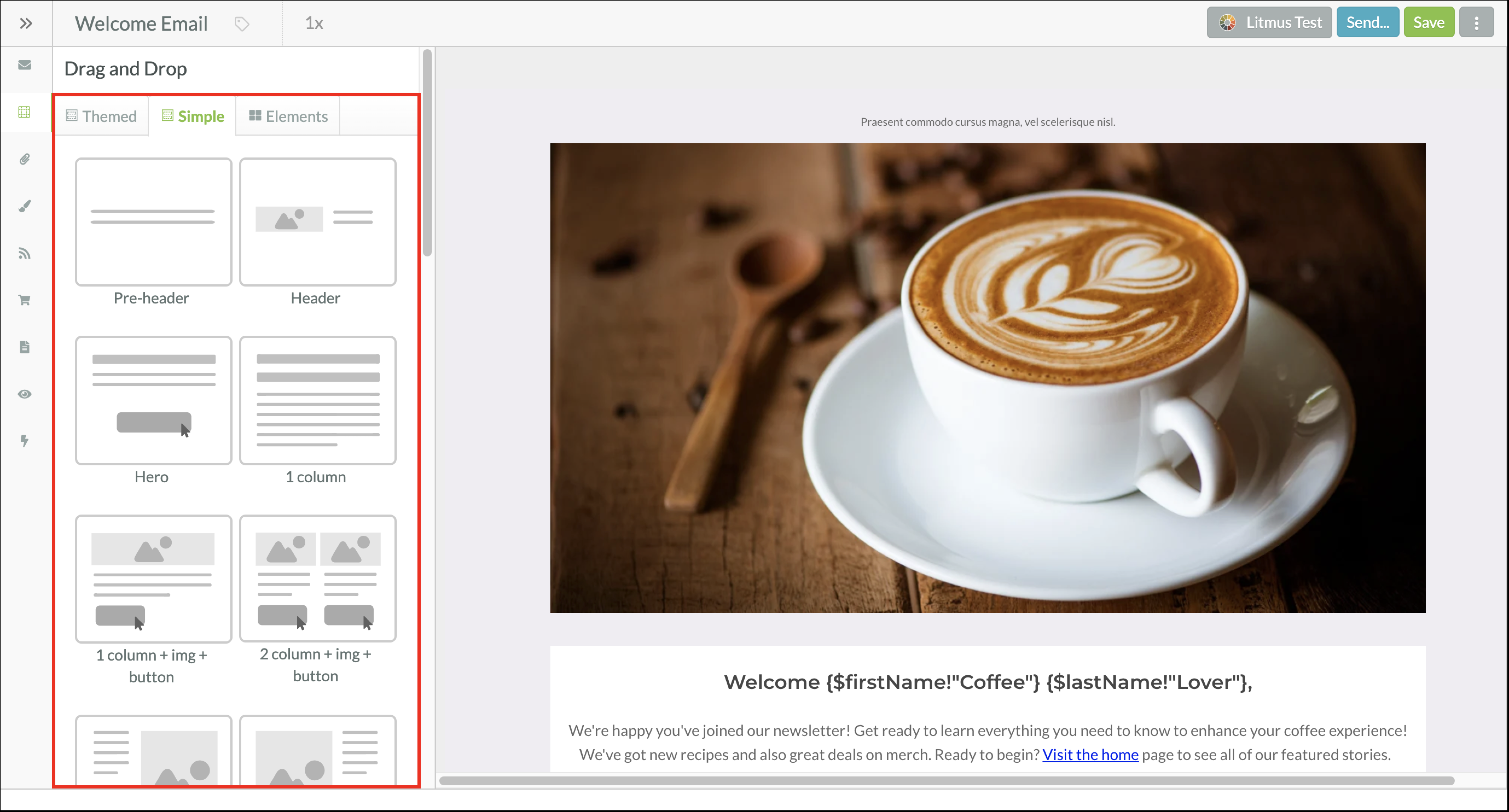
The types of simple layout blocks available include:
| Layout | Description | Image | |||
| Pre-Header |
Small, centered text that normally precedes header content. Block may contain text. |  | |||
| Header |
A block of information that normally contains a company logo, slogans, social links, and other introductory content. Best placed at the top of an email. Block may contain an image and text. |  | |||
| Hero |
A way to present information in a compact and visually arresting way. Informational text is funneled down into a call-to-action button. Content is placed over a larger image. Block may contain an image, text, and a button. |  | |||
| One Column |
A block of text that extends across the width of the entire email. Text is presented in a single, large column. Block may contain text. |  | |||
| One Column + Image + Button |
A large-sized image that extends across the width of the entire email. A single column of text is placed below the image, and it also extends across the width of the entire email. A call-to-action button is placed below the text block. Block may contain an image, text, and a button. |  | |||
| Two Column + Image + Button |
Two medium-sized images sit atop blocks of text, which sit atop call-to-action buttons. Images, text, and buttons are separated into two equally sized columns. Block may contain images, text, and buttons. |  | |||
| One Column Text + Two Column Image |
A block of text sits atop a call-to-action button on the left side of the email. A large-sized image sits on the right side of the email. The text and button take up one-third of the available email space, and the image takes up the other two-thirds. Block may contain an image, text, and a button. |  | |||
| Two Column Image + One Column Text |
A large-sized image sits on the left side of the email. A block of text sits atop a call-to-action button on the right side of the email. The text and button take up one-third of the available email space, and the image takes up the other two-thirds. Block may contain an image, text, and a button. |  | |||
| Full Width Image |
A single large-sized image that extends across the entire width of the email, including its margins. Block may contain an image. |  | |||
| Three Column + Image + Button |
Three small-sized images sit atop blocks of text, which sit atop call-to-action buttons. Images, text, and buttons are separated into three equally sized columns. Block may contain images, text, and buttons. |  | |||
| One Column Image + One Column Text |
A medium-sized image sits on the left side of the email. A block of text sits atop a call-to-action button on the right side of the email. The text and button take up half of the available email space, and the image takes up the other half. Block may contain an image, text, and a button. |  | |||
| One Column Text + One Column Image |
A block of text sits atop a call-to-action button on the left side of the email. A medium-sized image sits on the right side of the email. The text and button take up half of the available email space, and the image takes up the other half. Block may contain an image, text, and a button. |  | |||
| One Column Image + Two Column Text |
A small-sized image sits on the left side of the email. A block of text sits atop a call-to-action button on the right side of the email. The text and button take up two-thirds of the available email space, and the image takes up the other one-third. Block may contain an image, text, and a button. |  | |||
| Two Column Text + One Column Image |
A block of text sits atop a call-to-action button on the left side of the email. A small-sized image sits on the right side of the email. The text and button take up two-thirds of the available email space, and the image takes up the other one-third. Block may contain an image, text, and a button. |  | |||
| Full Width Image + Padding |
A single large-sized image that extends across the entire width of the email, stopping at its margins. Block may contain an image. |  | |||
| One Column + Small Image + Button |
A small-sized image sits atop a single-column block of text, which sits atop a call-to-action button. Text is presented in a single, large column. Block may contain an image, text, and a button. |  | |||
| Two Column + Button |
Two blocks of text sit atop call-to-action buttons. Text and buttons are separated into two equally sized columns. Block may contain images, text, and buttons. |  | |||
| Three Column + Button |
Three blocks of text sit atop call-to-action buttons. Text and buttons are separated into three equally sized columns. Block may contain images, text, and buttons. |  | |||
| Two Column Feature List |
Two blocks of text sit atop call-to-action buttons. Text is presented as numbered lists. Text and buttons are separated into two equally sized columns. Block may contain images, text, and buttons. |  | |||
| Two Column + Full Image Left |
A large-sized image sits on the left side of the email, extending into its top, bottom, and left margins. A block of text sits atop a call-to-action button on the right side of the email. The text and button take up half of the available email space, and the image takes up the other half. Block may contain an image, text, and a button. |  | |||
| Two Column + Full Image Right |
A block of text sits atop a call-to-action button on the left side of the email. A large-sized image sits on the right side of the email, extending into its top, bottom, and right margins. The text and button take up half of the available email space, and the image takes up the other half. Block may contain an image, text, and a button. |  | |||
| Two Column + One Column Button |
A block of text sits on the left side of the email. A call-to-action button sits on the right side of the email. The text takes up two-thirds of the available email space, and the button takes up the other one-third. Block may contain an image, text, and a button. |  | |||
| Footer Links |
A collection of phone, email, and social media links. Contains space for a logo. Information is presented in three columns. Best placed at the bottom of an email. Block may contain images and text. |  | |||
| Footer Social |
A compact collection of social media links, phone numbers, and addresses. Information is presented in one column. Best placed at the bottom of an email. Block may contain images and text. |  | |||
| Text Area |
A block of text that extends across the width of the entire email. Text is presented in a single, large column. Block may contain text. |  |
Items in the  Elements tab are, as the name implies, the basic elements that make up a content block. Elements must be placed inside of a layout block. They cannot be placed outside of layouts.
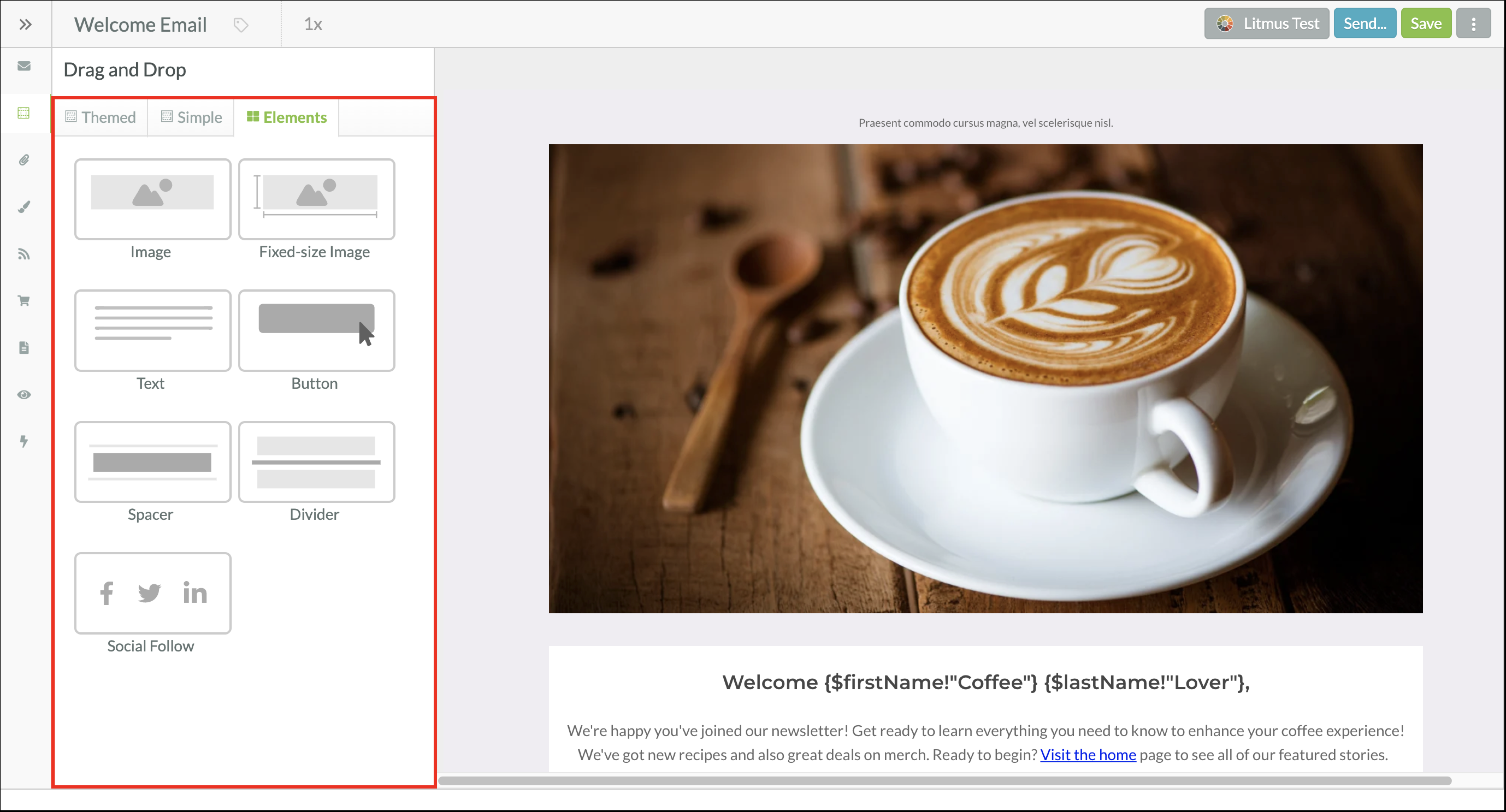
Available Elements include:
| Element | Description | Image | |||
| Image |
A single large-sized image that extends across the entire width of the email, stopping at its margins. Dimensions can be edited independently of one another. Read Adding Images to Emails to learn more about image elements. |
| |||
| Fixed-Size Image |
An image with editable dimensions. When the height or width is edited, the other will be automatically resized to have the same dimensions. Read Adding Images to Emails to learn more about image elements. |
| |||
| Text |
A block of text that extends across the width of the entire email. Text is presented in a single, large column. Read Adding Text to Emails to learn more about text elements. |
| |||
| Button |
An editable call-to-action button. Read Adding Buttons to Emails to learn more about button elements. |
| |||
| Spacer |
An editable block of empty space. You may increase or decrease the height of the space. Read Adding Space to Emails to learn more about Spacer elements. |
| |||
| Divider |
An editable horizontal rule. You may adjust the thickness, width, and color of Dividers. Read Adding Dividers to Emails to learn more about Divider element. |
| |||
| Social Follow |
An editable collection of social media icons and links. You may edit which social icon is displayed, the icon style, and the links. Read Adding Social Media Services to Emails to learn more about Social Follow icon elements. |
|
The email designer allows you to drag, drop, and reorder layout blocks into your email to further customize it.
To add layout blocks, create or edit an email from the Email page in the left toolbar.
Content and Layout. Move to reorder layout blocks.
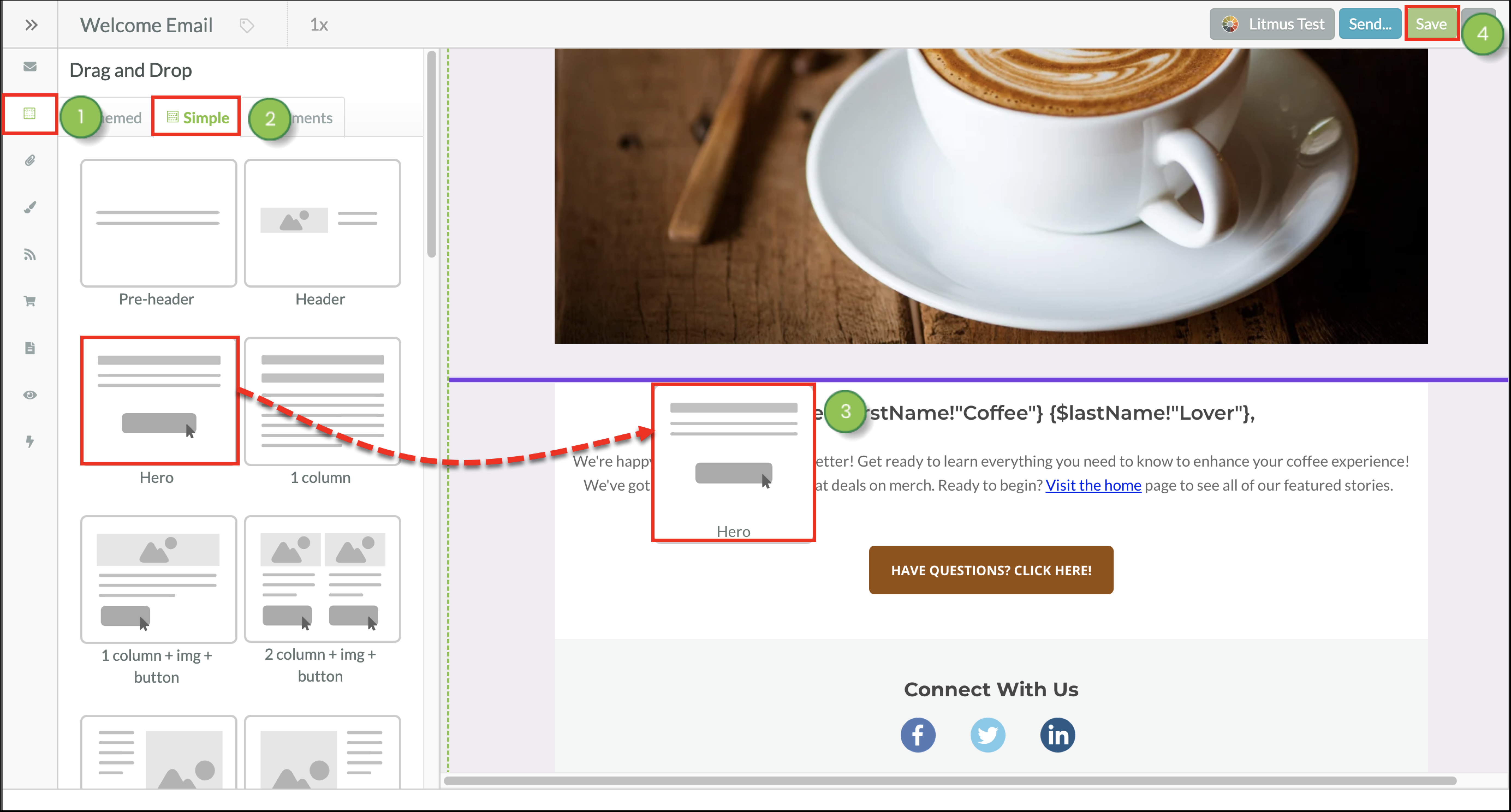
You can add elements to layout blocks. Elements are individual portions of layouts that you can add to preexisting layouts, to enhance their design or compensate for something missing from your intended design.
To add elements to layout blocks, create or edit an email from the Email page in the left toolbar.
Content and Layout in the Email Designer toolbar. Move to reorder the element.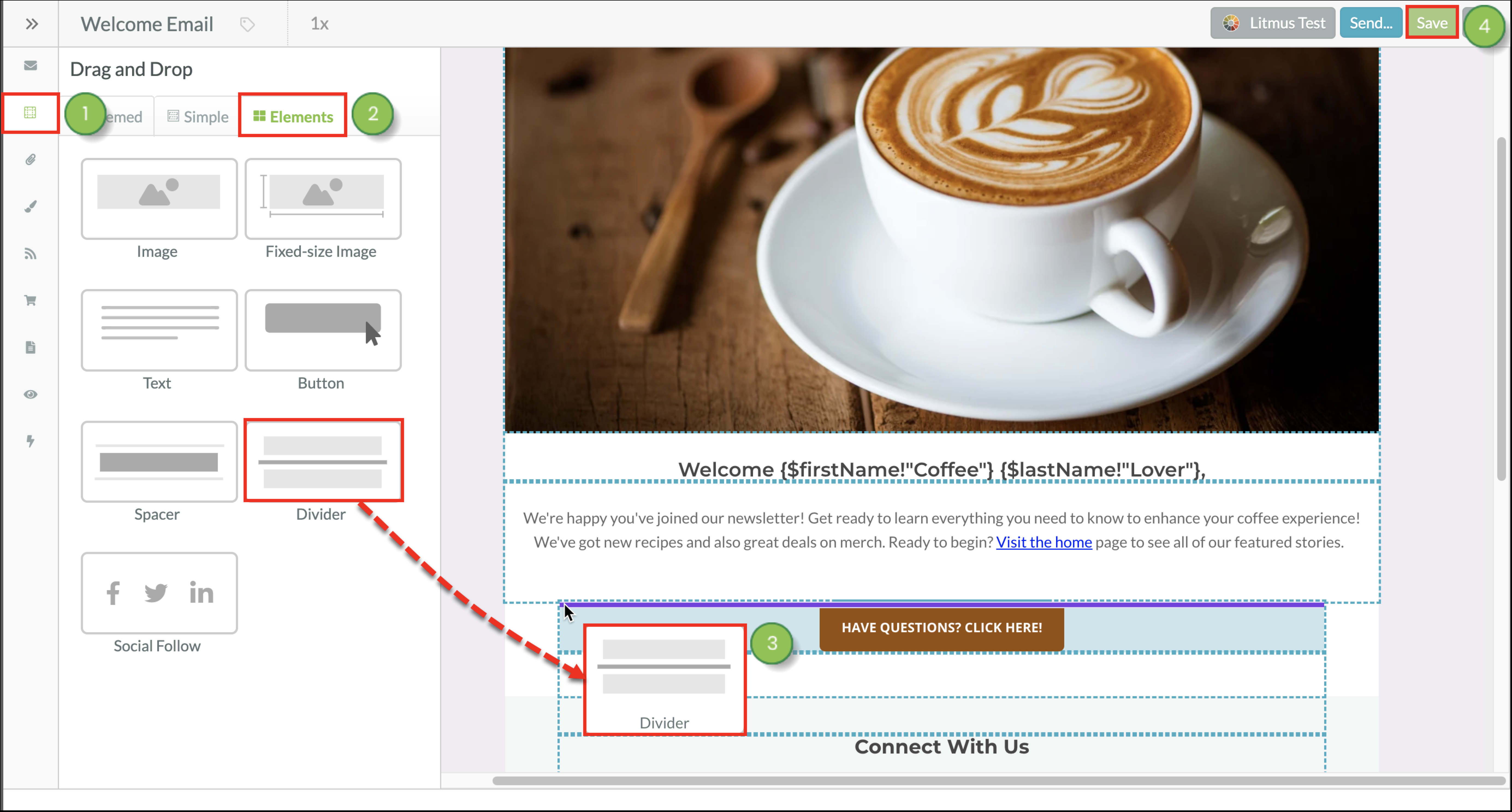
Refer to the following help articles for more information on using different element blocks:
After inserting a layout or element, you may want to reorder them and modify their placement in an email.
To reorder layout blocks, create or edit an email from the Email page in the left toolbar.
Drag to Reorder button.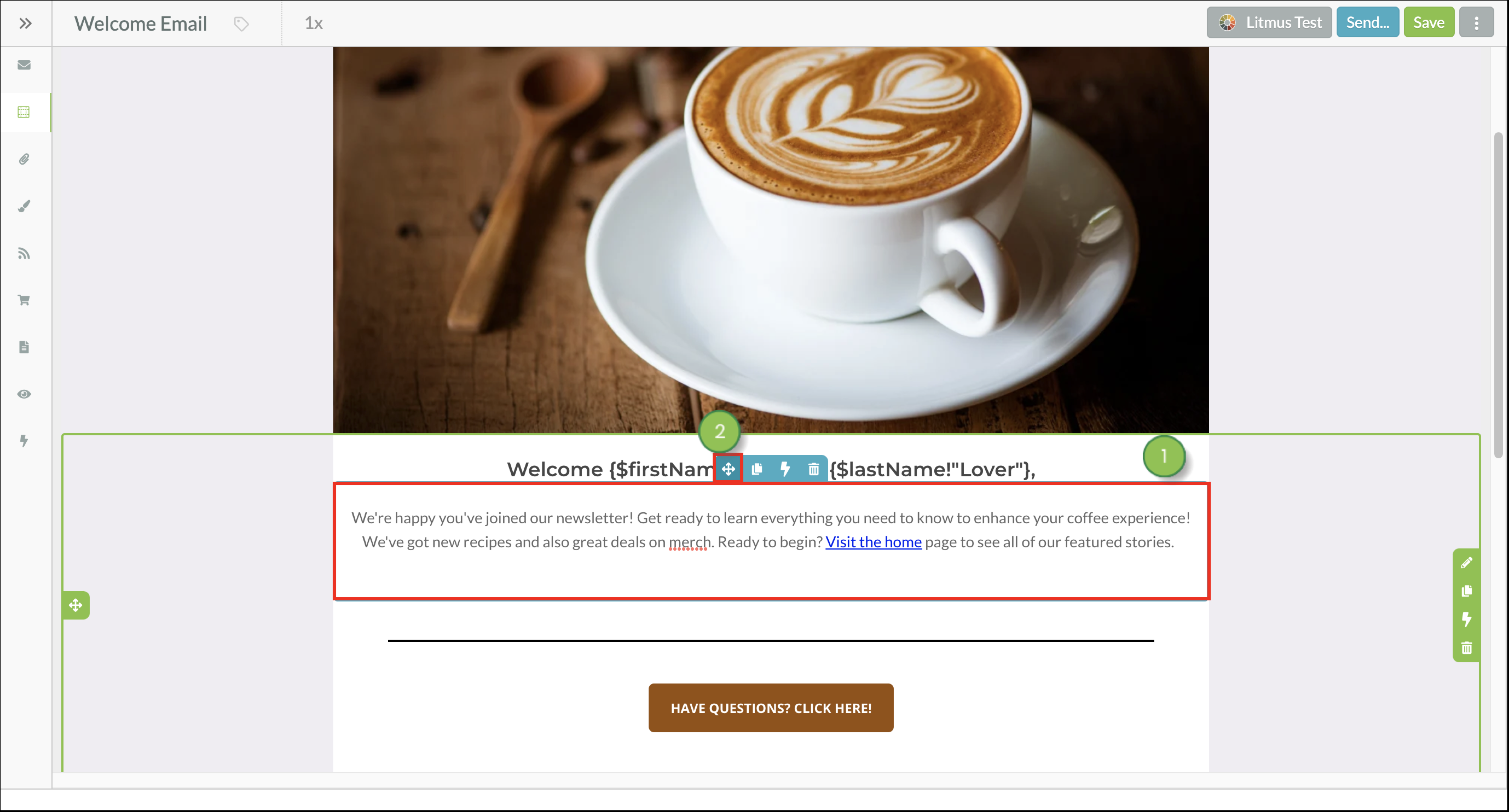
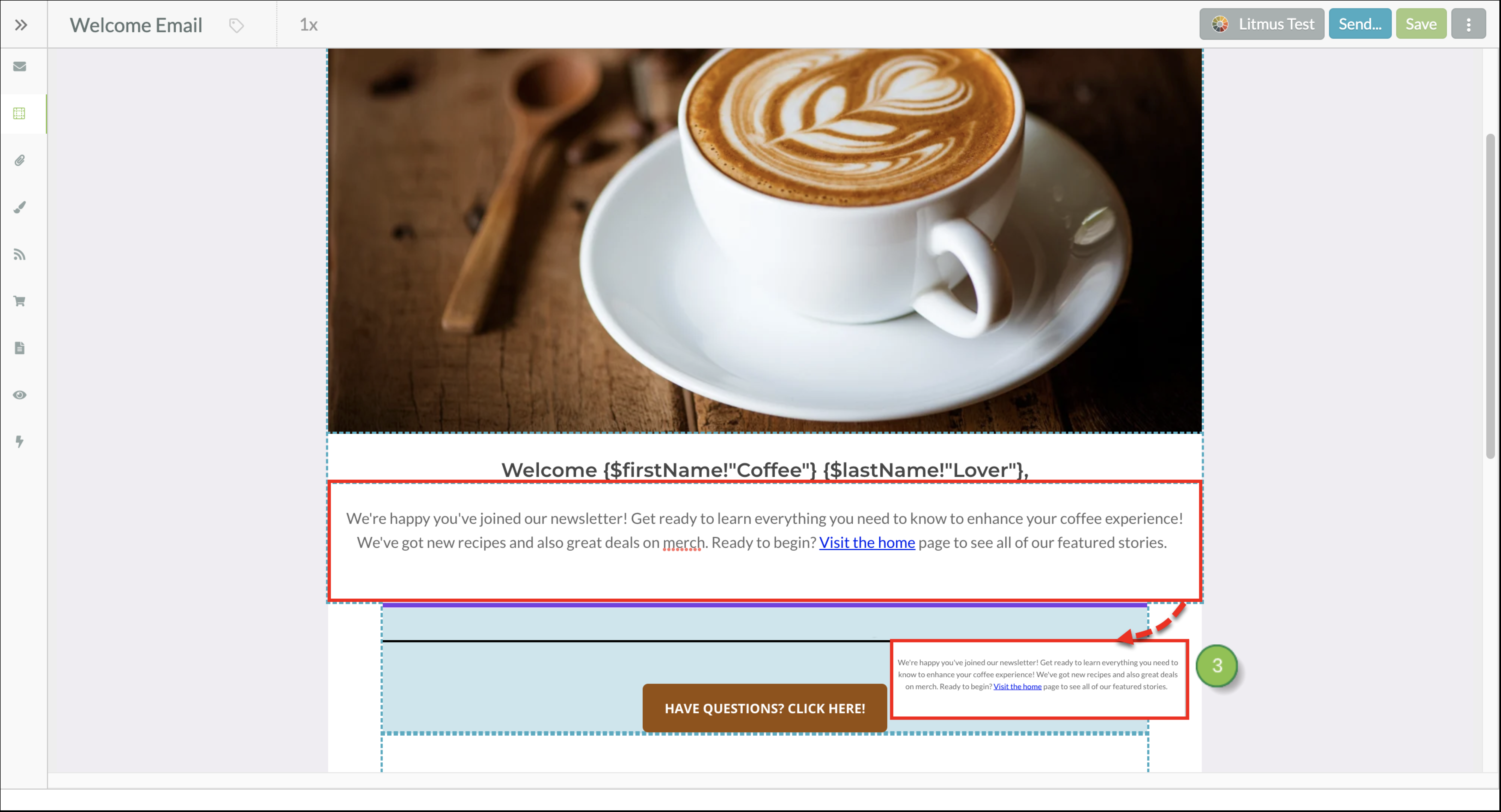
Clicking and dragging the Drag to Reorder option allows you to place the layout block or element anywhere in the email where there is a purple line. The purple lines serve as anchor points and keep layouts and elements in fixed locations within the email.
Once layout blocks have been added to your email you can customize them for a more efficient design experience. You can:
To learn how to customize your layout blocks, read Customizing Layout Blocks in Emails.
Copyright © 2026 · All Rights Reserved · Constant Contact · Privacy Center