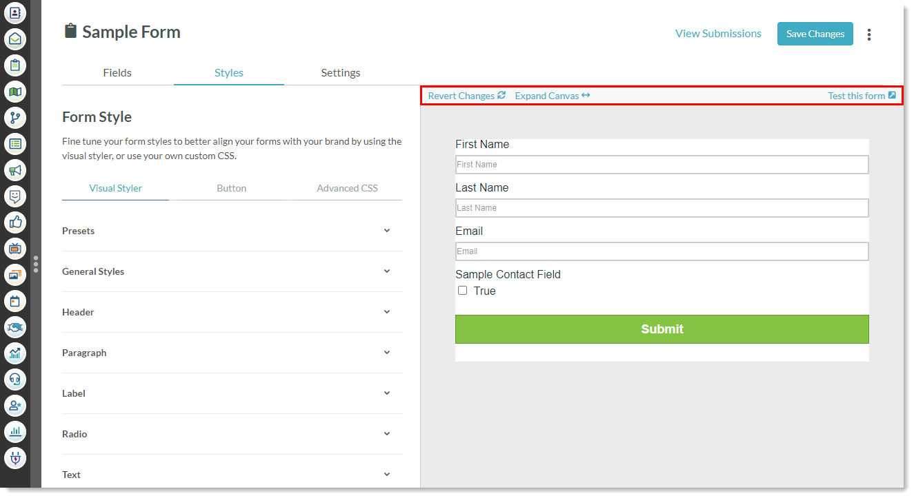
Inserting fields into forms is only part of the form creation process. You can design and customize the look and feel of every part of your form using the Visual Form Styler. If you like the way your form looks, you can save it as a preset for future use.
| Administrators | ✓ | |
| Company Managers | ✓ | |
| Marketing Managers | ✓ | |
| Sales Managers | ||
| Salespersons | ||
| Jr. Salespersons |
 | Tip: Are you looking for information about Constant Contact’s Email and Digital Marketing product? This article is for Constant Contact’s Lead Gen & CRM product. Head on over to the Email and Digital Marketing articles by clicking here. Not sure what the difference is? Read this article. |
When creating a form, the Visual Form Styler, located within the Styles tab, offers a way to see your design changes in real time. The Visual Form Styler is broken into different categories, each covering a specific portion of the form. Within these categories, you can configure the various design aspects of the form.
The available categories are as follows:
| Category | Description | |||
|
General Styles | This category deals solely with the form's background color and padding. | |||
|
Checkbox |
This category offers ways to modify text and appearance of checkbox fields. | |||
|
Drop-down |
This category provides settings that modify the text and appearance of drop-down fields, as well as the color of the drop-down menus. | |||
|
Header |
This category modifies the appearance of all header elements. | |||
|
Label |
This category provides settings that determine whether labels will appear over their respective text entry fields, as well as ways to modify their overall appearance. | |||
|
Paragraph |
This category modifies the appearance of all paragraph elements. | |||
|
Presets |
This category deals solely with saving and loading form styles. | |||
|
Radio |
This category provides settings that modify the text and appearance of radio fields. | |||
|
Text |
This category provides settings that modify the text and appearance of text entry fields. |
The Visual Form Styler offers different ways to customize your form. These settings impact the look and feel of your form in different ways. Some settings modify the color of the form or its text, and others modify the overall spacing between individual parts of the form.
The following are settings that are available within the various Visual Styler categories:
| Setting | Categories | Description | ||||
|
Background Color |
|
Changes the background color of specified content to a specific color. Color can be entered in hexadecimal format. It can also be selected from the color picker. | ||||
|
Border Color |
|
Changes the border color for specified content. Color can be entered in hexadecimal format. It can also be selected from the color picker. | ||||
|
Border Size |
|
Changes the border size for specified content. A border's size can be entered as a number ranging from 0 to 64. It can also be selected from the associated scale. | ||||
|
Border Style |
|
Changes the appearance of border edges for specified content. Border styles are selected from the associated drop-down menu. | ||||
|
Border Radius |
|
Changes the sharpness of border edges for specified content. A border's radius can be entered as a number ranging from 0 to 20. It can also be selected from the associated scale. | ||||
|
Display |
|
Enables or disables text over form fields. Display status is selected from the associated drop-down menu. | ||||
|
Font Color |
|
Changes text in specified content to a specific color. Color can be entered in hexadecimal format. It can also be selected from the color picker. | ||||
|
Font Family |
|
Changes text in specified content to a specific universal font. Font families are selected from the associated drop-down menu. | ||||
|
Font Size |
|
Changes text in specified content to a specific size. A font's size can be entered as a number ranging from 4 to 64. It can also be selected from the associated scale. | ||||
|
Font Weight |
|
Sets text in specified content as either normal or bold. Font weights are selected from the associated drop-down menu. | ||||
|
Letter Spacing |
|
Changes the spacing between letters for text in specified content. Letter spacing can be entered as a number ranging from 0.0 to 2.0. It can also be selected from the associated scale. | ||||
|
Line Height |
|
Changes the distance between lines of text around the specified content. Line height can be entered as a number ranging from 0.0 to 2.0. It can also be selected from the associated scale. | ||||
|
Text Alignment |
|
Sets the alignment of text in text fields. Alignments are selected from the associated drop-down menu. | ||||
|
X Padding |
|
Changes the amount of horizontal padding in specified content. Padding can be entered as a number ranging from 0 to 100. It can also be selected from the associated scale. | ||||
|
Y Padding |
|
Changes the amount of vertical padding in specified content. Padding can be entered as a number ranging from 0 to 100. It can also be selected from the associated scale. |
When customizing form content, your changes will be displayed in the Visual Form Styler canvas on the right side of the screen.
The canvas also houses a select few options that help with the creation process.
The available options are as follows:
| Option | Description | |||
|
Expand Canvas/ | Expands the form's width in the canvas. Also returns the form's width to its default size. | | ||
|
Revert Changes |
Reverts all changes made to form content. Changes will revert to the default state of the form preset. | | ||
|
Test This Form |
Opens the form in a new browser tab. The form's different components can be interacted with. Test information will be sent if submitted, but tracking will not be established. |
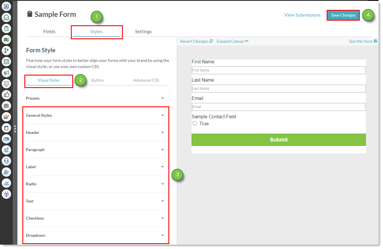
To configure the design of a form in the Visual Styler, create or edit a form:
|
|
Refer to the following help articles for information on further customizing form content:
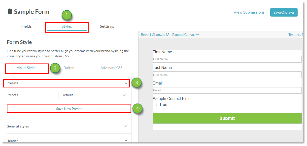
Presets are previously saved styles. Presets can be loaded into new forms, drastically reducing the time needed to customize and format forms.
You can save customized forms as presets. These saved presets can be used at a future date, their overall structure and format ready for use.
To save presets, create or edit a form:

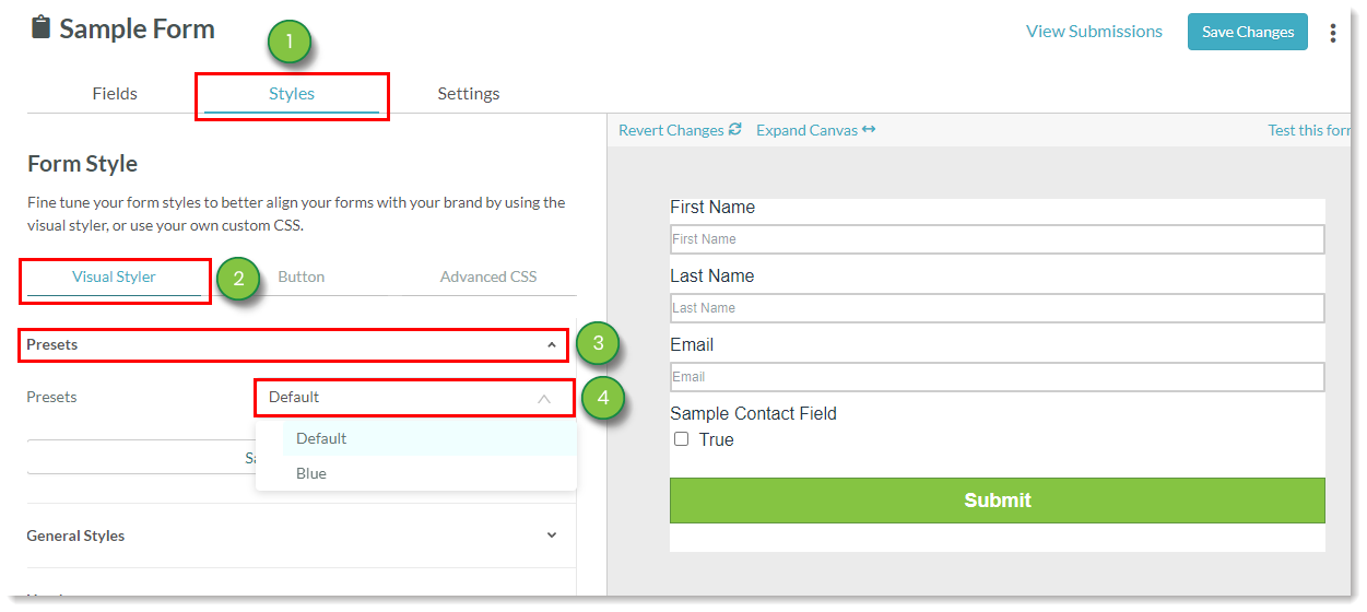
You can load previously saved presets. Loaded presets will populate with their previously customized formatting and structure.
To load presets, create or edit a form:
Copyright © 2026 · All Rights Reserved · Constant Contact · Privacy Center