A clear call-to-action in your email is essential for engaging your contacts and driving them to complete that action. Using an eye-catching button is more effective than a regular text link at drawing your readers' attention.
Insert a button
Where's the best location for a button? You want to build up to an action—place your supporting images and text before the button to provide context that persuades your readers to click. It helps to keep your email short so the button stays near the top, and your contacts don't have to scroll too far to see it.
- If there isn't already one, drag a Button block into your template. Use the guidelines to help you find the right spot.
Tip: Button blocks can stretch the width of the entire template or can be added in columns. If you have several buttons that you want to align with even horizontal spacing, create multiple columns and add a button to each column.
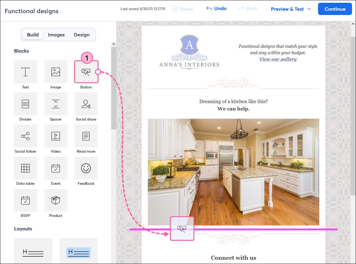
- Click on the button to open the panel on the left. Then click the link icon and select Web Page from the drop-down.
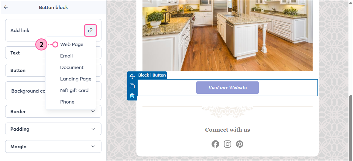
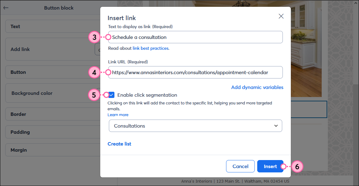
- Update the text to display on your button. Keep your text short, actionable, and descriptive so your contacts know what to expect when they click on your button.
- Paste the URL you want to drive your readers to into the Link URL field.
- (Optional) Check the box to enable click segmentation, then choose the list you want to have your contacts added to when they click the button.
- Click Insert.
The button size increases or decreases based on the amount of text and the font size you choose.
Examples of actionable button text:
| Button phrases that convey urgency: | | | | | | | Button phrases that convey ease: |
- Buy it now
- Shop the sale
- Get your own
- Sign up
- Download
- Donate today
- Support our cause
- Reserve your seat
- Register today
| | | | | | |
- Discover
- Explore
- Check out the deals
- Find yours
- Learn more
- See details
- Take a look
- Try it yourself
- Please RSVP
|
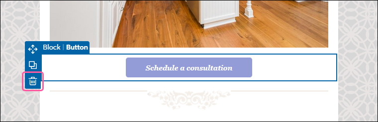
If you need to delete a button from your email template, simply hover your mouse over the button and click the trash can icon:
Style an individual button
If you want to make a button stand out from the rest, or have it fade into the background a little so that it doesn't compete with your main call-to-action, you can use the options found in the side panel to customize an individual button's text, shape, color, and more.
After clicking on the button:
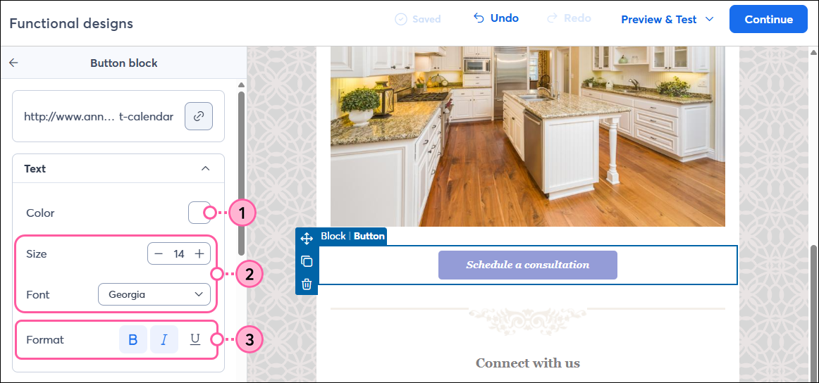
- Choose the text color. It should have good contrast with your button color so it's easy to read.
Note: There are accessibility tools online, like the color contrast analyzer in Adobe Color, that can help you choose the right colors. - Select a font and size for the button text. Make sure to choose a combination that is easy to read!
- Apply emphasis to the button text with bolding, italics, or an underline.
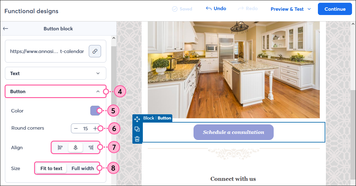
- If needed, click to expand the Button section.
- Click the Color swatch to select from the Basic, Recent, or Saved Colors, or click Advanced to add a specific hex value. Use a bold, bright color to help draw the eye.
- Adjust the Round corners to change the button's shape. The higher the number, the more rounded the button corners become.
- Align the button to the left, center, or right side of the email.
- Choose if you want to size the button based on the text length or have it span the full width of the email.
- Click the Background color swatch to choose a color for the background of the button block.
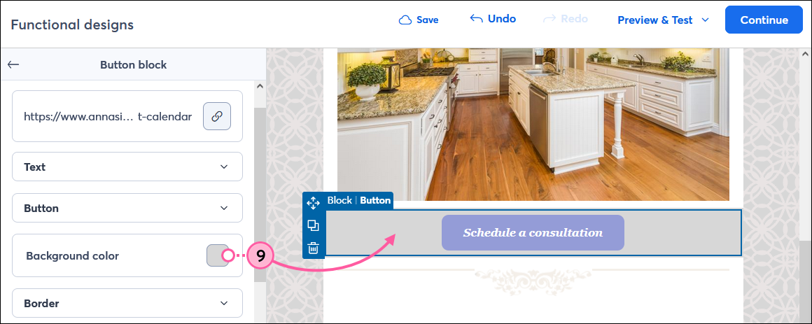
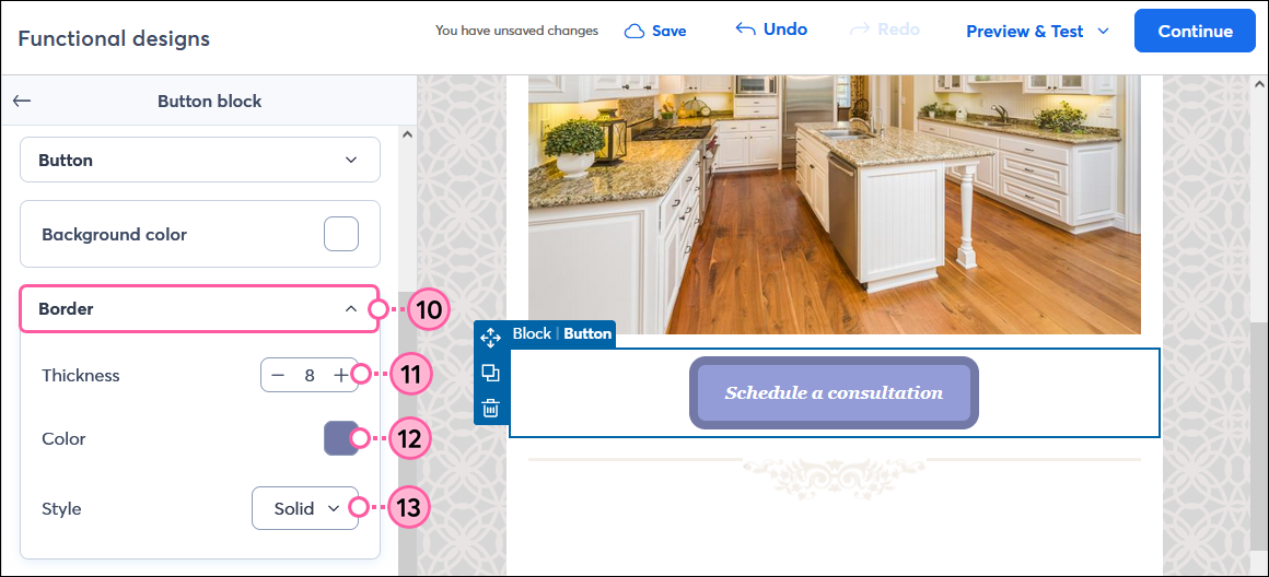
- If needed, click to expand the Border section.
- Adjust the thickness if you want to add a border around your button.
- Click the color swatch to select a color for your button border.
- Use the Style drop-down to select if you want a solid, dashed, or dotted border.
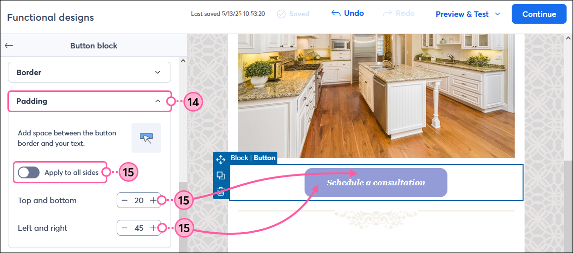
- If needed, click to expand the Padding section.
- Click the toggle to apply the same amount of padding around all sides of your button text and choose the amount of padding you want, or adjust the padding for the top and bottom, and left and right of the text.
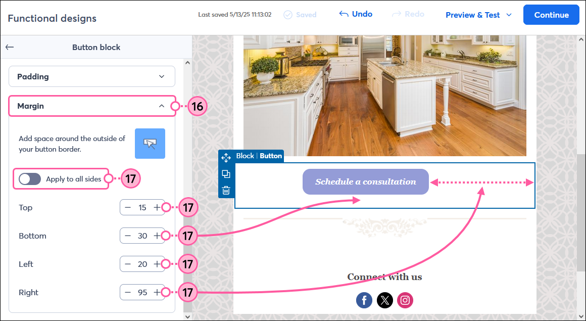
- If needed, click to expand the Margin section.
- Click the toggle to apply the same margins around all sides of your button and choose the amount of space you want, or adjust the margin for the top, bottom, left, and right of the button.
 | Design tip: Spacers are a great way to add some white space above and below your button to draw your readers' attention further. |
Apply a style to all the buttons in your email
It's totally fine to have multiple buttons in your email when you have different options for the same call-to-action. Keeping the color and style consistent makes it easier for your readers to identify each call-to-action as they skim your email. If you want to change the color and text for all the buttons in your email template, you can set these styles through the Design tab.
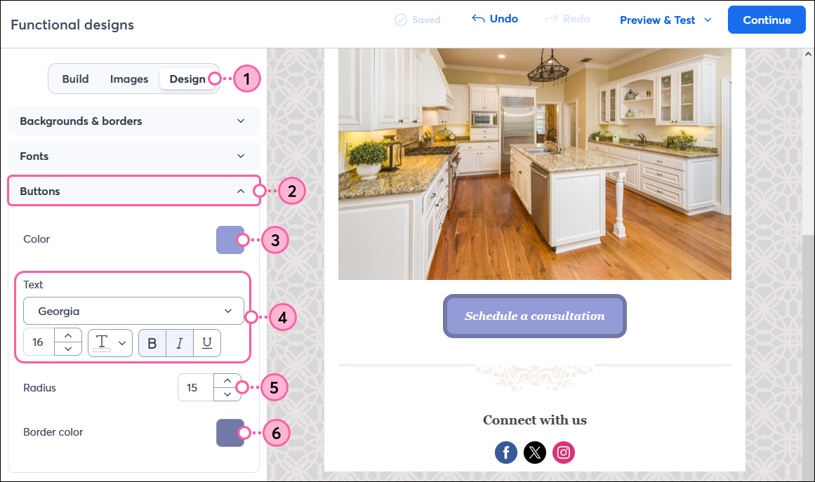
- Click the Design tab.
- Click to expand the Buttons section.
- Choose a color for all the buttons in your email.
- Choose the font, size, color, and emphasis for the text that displays on the buttons.
- Use the arrows to increase the Radius and make your button corners more rounded, or decrease the radius to square them off.
- Choose a Border color for all buttons that have a border in your email.
Note: This won’t apply to individual buttons you previously added a border to using the steps above, but it will become the default border color for any buttons you add a border to going forward.
Not seeing your button styles change? If you’ve previously customized an individual button, styles applied from the Design tab won’t affect it. However, deleting the button and adding a new button resets the style to be compatible with the Design tab.
Any links we provide from non-Constant Contact sites or information about non-Constant Contact products or services are provided as a courtesy and should not be construed as an endorsement by Constant Contact.