When creating and editing a landing page, you can preview how the page will display on a desktop computer, tablet, and mobile device. You can also edit how the content on your landing page appears on various devices.
| Administrators | ✓ | |
| Company Managers | ✓ | |
| Marketing Managers | ✓ | |
| Sales Managers | ||
| Salespersons | ||
| Jr. Salespersons |
 | Tip: Are you looking for information about Constant Contact’s Email and Digital Marketing product? This article is for Constant Contact’s Lead Gen & CRM product. Head on over to the Email and Digital Marketing articles by clicking here. Not sure what the difference is? Read this article. |
You can preview how a landing page appears on different devices. This feature allows you to view content on a desktop, tablet, or mobile device.
To preview landing pages on different devices, at the top of the landing page editor, select one of the following device views:
•  Desktop
•  Tablet
•  Mobile
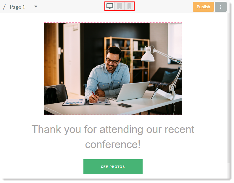
You can edit landing page content to appear differently on different viewing devices.
To edit content at the device level, create or edit a landing page and then insert desired layouts and elements:
Desktop tab and modify the available settings for the layout or element. 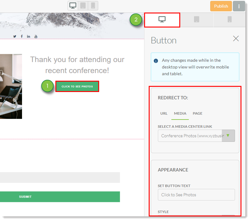 Tablet tab and modify the available settings for the layout or element.
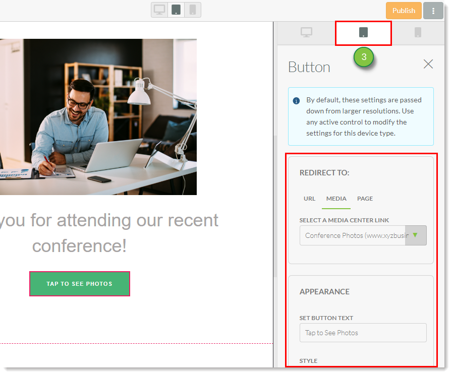 Mobile tab and modify the available settings for the layout or element.
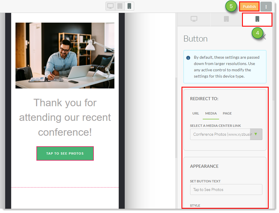
Note: Certain settings and styles may only be changed in the Desktop tab. These settings will be faded out in the Tablet and Mobile tabs.
Making changes to the layout and element settings of the desktop version of a landing page will overwrite changes made to layout and element settings of tablet and mobile versions of the landing page. Make changes to the desktop version of the landing page first before modifying tablet and mobile versions.
However, setting changes made to mobile versions of a landing page do not carry over to tablet or desktop versions of the landing page. In the same way, setting changes made to tablet and mobile versions of a landing page do not carry over to desktop versions of the landing page.
This only applies to content settings. Reordering content in any version of the landing page will reorder that content across all versions of the landing page. Deleting content from any version of the landing page will delete the content from all versions of the landing page.
Images can only take up so much space on mobile devices, as tablet and mobile screens have only so much available real estate. To compensate, you can edit the settings for images on different devices in the Landing Page Builder.
To modify image settings, insert an image element into the landing page:
Desktop tab and modify the desired image style settings.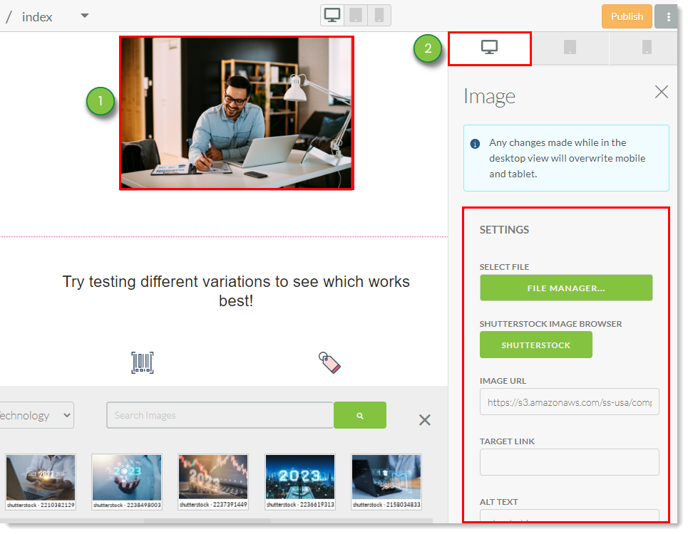 Tablet tab and modify the desired image style settings.
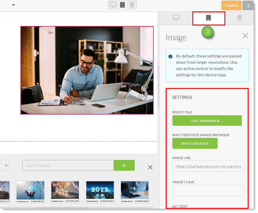 Mobile tab and modify the desired image style settings.
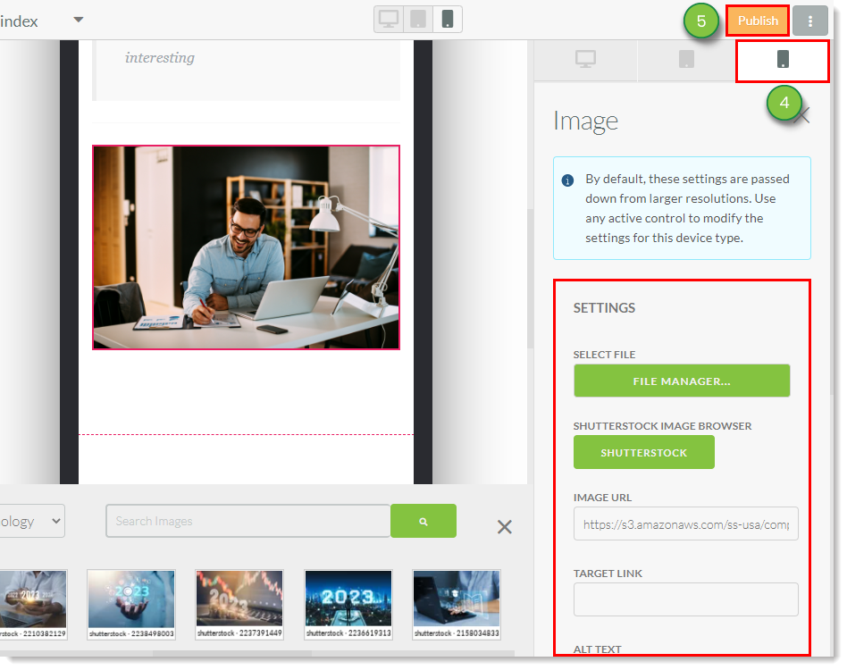
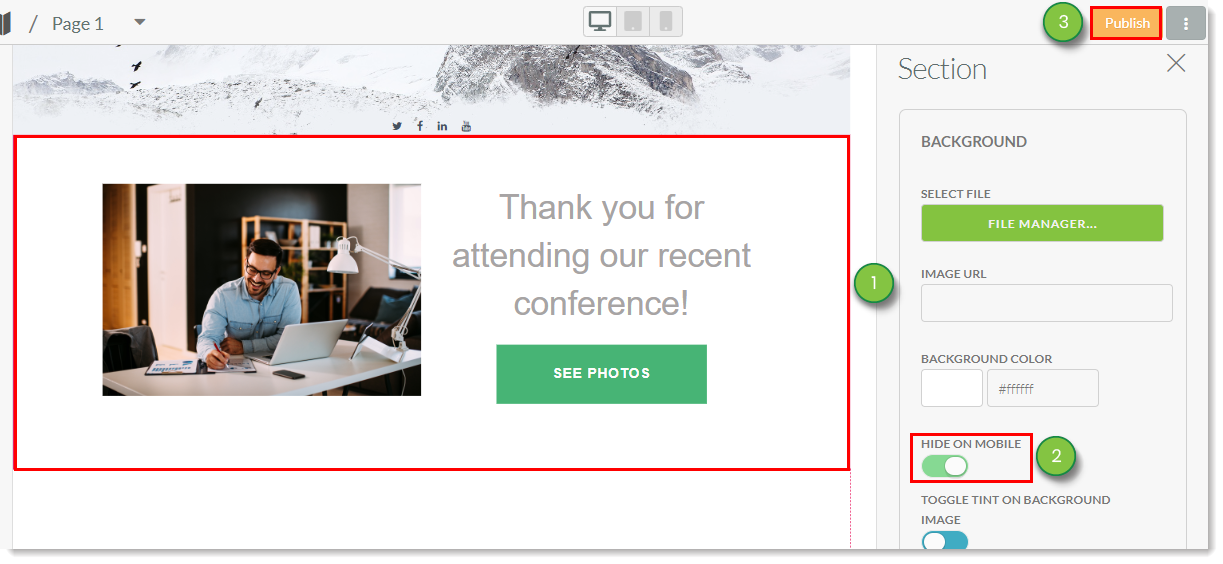
You can hide entire sections from displaying on mobile devices. This allows you to create a fully interactive version of your landing page for desktop devices, and streamlined versions of your landing page for tablet and mobile devices.
Hiding content for tablet mobile devices is as much a strategy and courtesy as it is a point of aesthetic design. These devices may have a harder time loading media-heavy content. In addition, data restrictions for phone or Internet data plans may cause page visitors on tablet and mobile devices to avoid making repeat visits to your pages.
To hide content for tablet and mobile devices, do the following:
Copyright © 2026 · All Rights Reserved · Constant Contact · Privacy Center