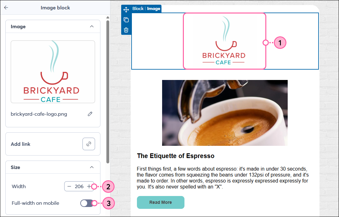
Once you've added an image to your email, you can proportionally increase or decrease the size by hand to set how you want it to look when your email is viewed on a desktop, or you can set a specific width and choose whether you want it to span the full width of the screen when the email is viewed on a mobile device.
 | Design tip: If you're seeing extra white space around your image and you want to get rid of it, you can remove the image padding. The background color of the block can also be changed, giving you additional styling options. |
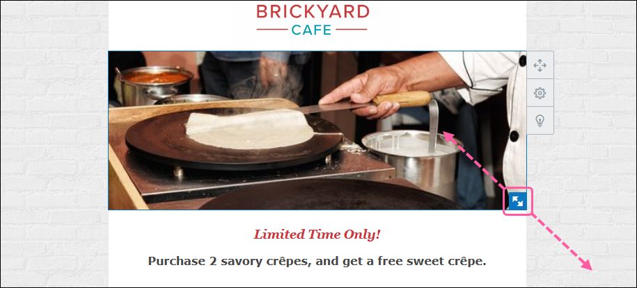
If your image isn't looking quite the way you want, try cropping it. Wide images work best as banner images because they retain more content when cropped.
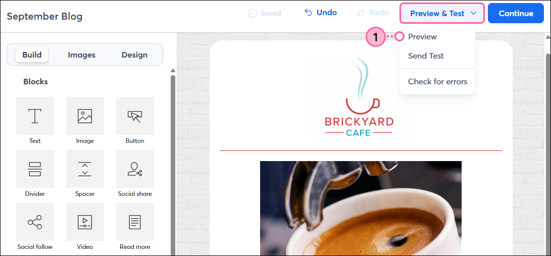
Now you can preview your email to make sure the image looks the way you want on both desktop and mobile:
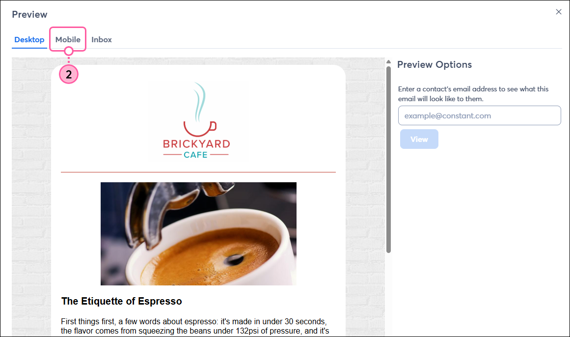
Make sure the image appears as intended when viewed on a mobile device.
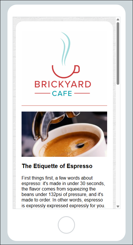 | 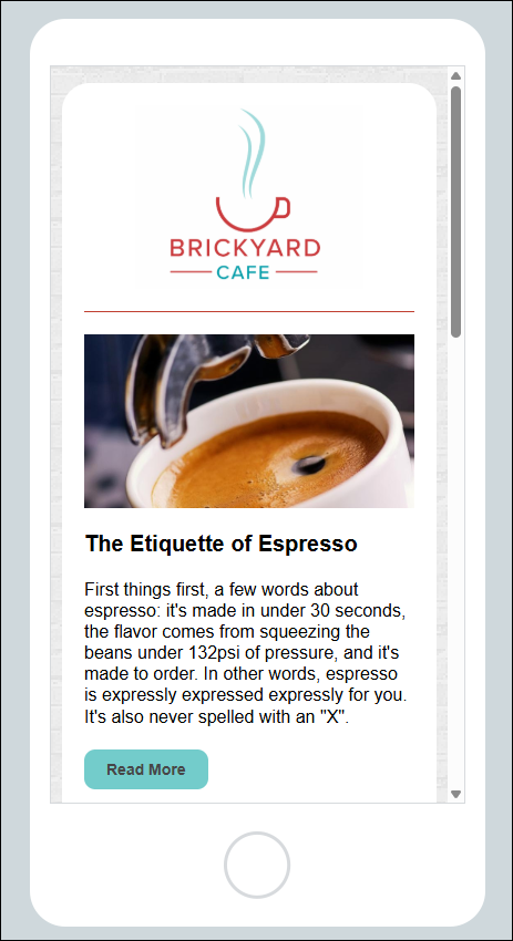 |
| The "Full width on mobile" toggle was turned on for the logo in this email, so it fills the width of the screen when viewed on a mobile device. | The "Full width on mobile" toggle was turned off for the logo in this email, so it maintains its dimensions and does not span the full width of the mobile screen. |
Copyright © 2026 · All Rights Reserved · Constant Contact · Privacy Center