Mobile devices, such as smartphones and tablets, are an increasingly popular way to view emails. The viewing experience on these devices is far different from that on a traditional computer. Mobile-responsive email templates use technology to adapt and format your email’s layout based on the screen size.
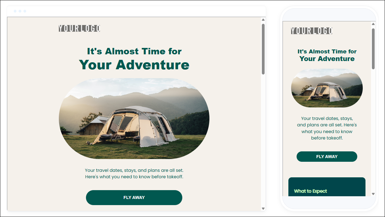
For example, a mobile-responsive email with an image and text to the right on a desktop appears stacked (i.e., the image on top with the text below) on a mobile device. This makes the email easier for the end user to read.
Text tips for mobile
As you can imagine, screen real estate is especially valuable on mobile. Some text that may appear normal on a desktop can shrink on another device, forcing your contacts to zoom in and out just to read portions of an email.
Ensure a great reading experience by following these guidelines:
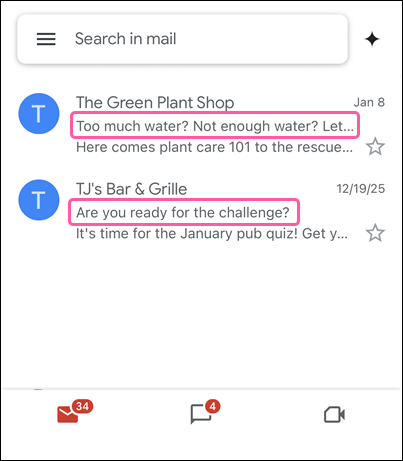
- Keep subject lines under 40 characters - Subject lines are often cut off in a phone's inbox. Keeping your subject line under 40 characters (including spaces) ensures that it will be read in its entirety.
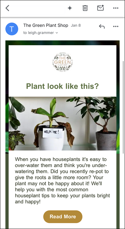
- Avoid tiny text - Use text that’s easy to read on any device. We recommend keeping the default sizes provided in the template. If you need to change them, then use 22pt for headlines and 14pt for body text. Choose web-safe fonts that are pre-installed on many devices, and don't use more than two different fonts. You'll get the best results with 20 lines of text. If your content is longer, then it's best to include a few short lines of "teaser" text with a button to read more online.
- Include alt text with images - People on mobile are usually on the go. As a result, they are always trying to conserve data. By going into their settings and selecting "Do not automatically download images," mobile users can drastically reduce data usage and load times. This means your images will take the hit. Including alt text with your images makes sure nothing is lost. It lets you convey the gist in words rather than pictures.
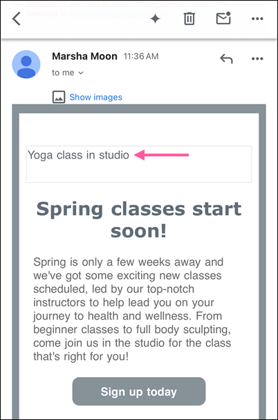
Image and design tips for mobile
If you've been copying the same old template over and over for a while, it's recommended that you create a new email to freshen up your design. All of our email templates are fully mobile-responsive. Whichever one you choose, using some common guidelines ensures that your email looks great, no matter what kind of device it's being viewed on:
- Customize for branding - Keep your color choices to under five (excluding black and white). Make sure your text color is legible against your background.
- Keep it short - Be mindful of the length of your message. Adding additional blocks will lengthen your message and make it difficult to consume on a smaller device. For most cases, you won’t need more than one image, three lines of text, and a clear call-to-action. An analysis of more than 2.1 million Constant Contact customer emails found that emails with three or fewer images and 20 lines of text saw the highest click rates.
- Line up your columns - You know those two- and three-column blocks? They don't display the same on mobile as they do on desktop. By default, they stack into a single long, scrolling email with the left-most column displayed first. You can control how you want the content to stack on mobile, but you should consider using columns sparingly. You only have about ten seconds to grab your readers' attention!
- Consider image sizes - Images that are 480 pixels wide or more will fill the entire screen width on mobile. For images you don’t want to span the width of the screen, such as logos and icons, either upload them at the size you want them to display, or resize them to 150-200 pixels wide when editing your email. There's less space on a mobile screen, so background images aren't as visible on mobile devices, too.
- Make your call-to-action a button - Have you ever tried to click a hyperlink on your phone? It's not easy. Improve ease-of-use by using buttons for your calls-to-action instead of text links. More than that, you could actually improve your click rates. Buttons are 25% more likely to be clicked compared to text alone.
Preview and test tips for mobile
When designing an email for mobile, keep in mind that different email clients and devices display content differently. A layout that looks perfect on mobile may appear stretched or reshuffled on a desktop. Be sure to preview and test your email on multiple devices to make sure your contacts always get the best possible viewing experience.
There are a couple of different ways to check what an email looks like across devices:
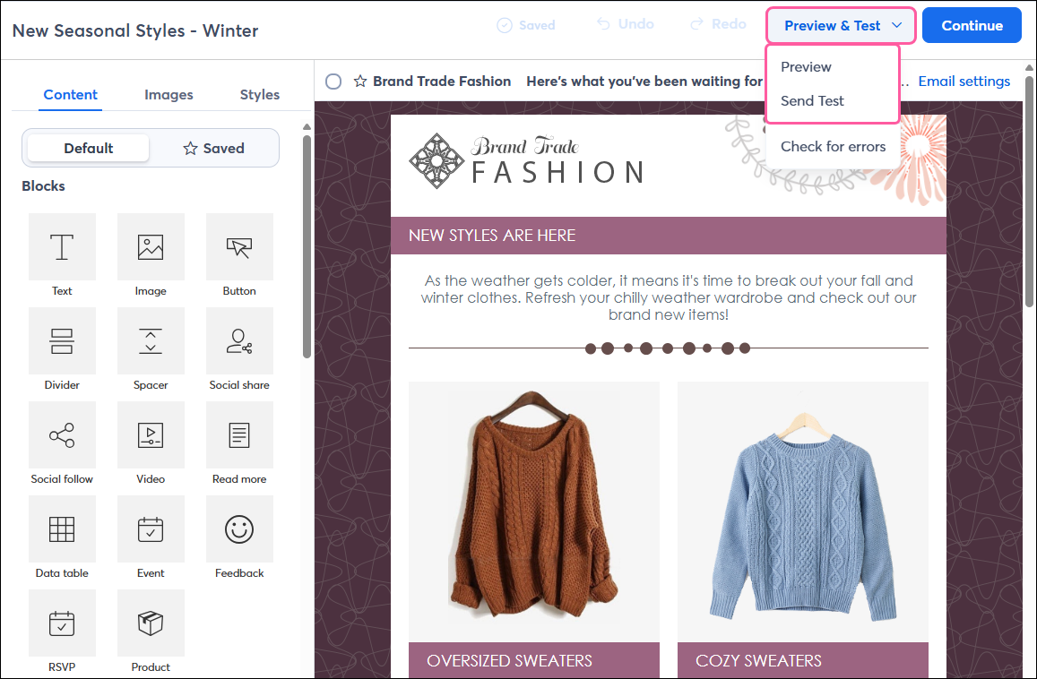
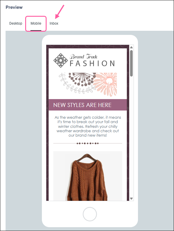
- Preview - Click the Preview & Test button while editing your email. You'll have a chance to see how your content stacks when viewed on a mobile device.
- Test email - Send yourself a test email and open it on your own smartphone or tablet to get a good idea of how your contacts will experience it.
- Inbox Preview: The majority of emails are opened in just 5 email clients. Inbox Preview shows you how your email looks in the most popular email clients on both desktop and mobile.
 | Our Professional Design service offers two packages to deliver the best-looking campaign design for your business. With different price points, it’s easy to pick the package that works best for you. Check out our Professional Design service today! |