Dark mode is a reversed color scheme that employs light-colored text, icons, and other elements on a dark background. It can be enabled on your device — and in some cases within an email client — and affects how emails appear, depending on the client (such as Outlook and Gmail), on both desktop and mobile devices.
Enabling light or dark mode on different devices
Contacts can enable light or dark mode on their Android phone, iOS device, Mac, or PC.
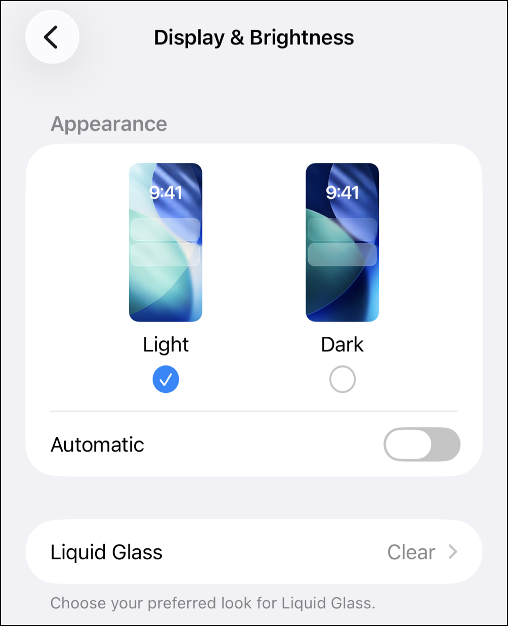
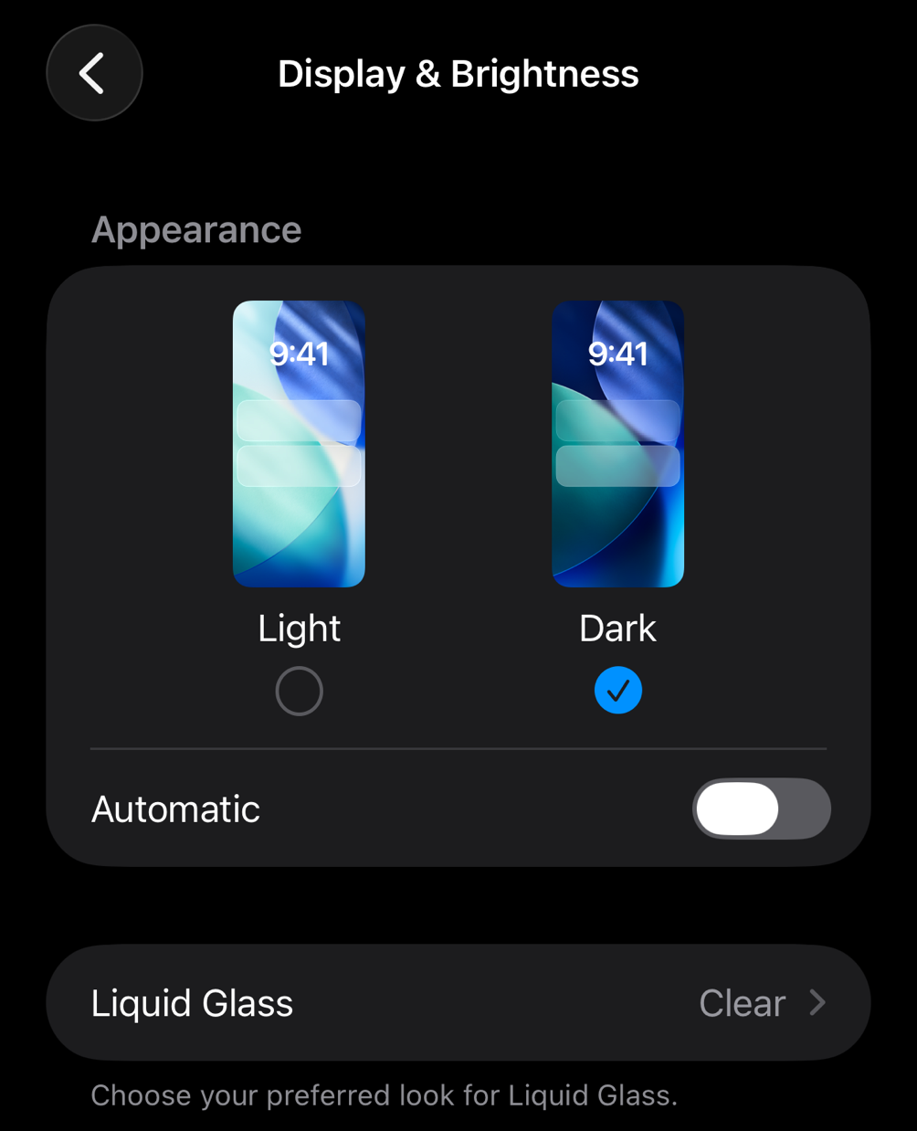
On iOS:
- Go to Settings.
- Go to Display & Brightness.
- Tap Light or Dark mode.
On Android:
- Go to Settings.
- Go to Display & Brightness.
- Tap Light or Dark mode.
On Mac:
- Go to the System Settings app.
- Click Appearance in the sidebar.
- Scroll down and select Auto, Light, or Dark.
On PC:
- Right-click any empty space on your desktop.
- Select Personalize.
- Select Colors
- Change "Choose your mode" (or "Choose your color") to Light or Dark.
|
Example of light mode (iOS device)
|
Example of dark mode (iOS device)
|
 |
 |
How dark mode impacts emails
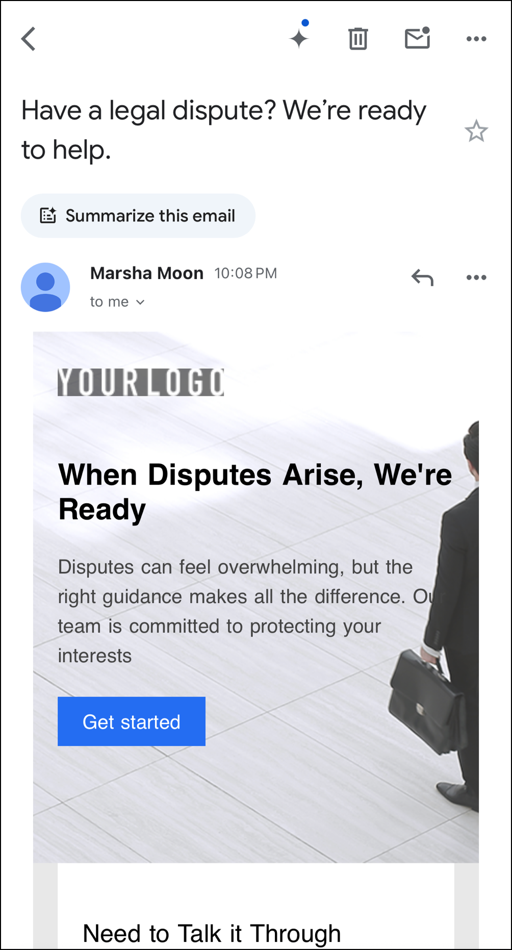
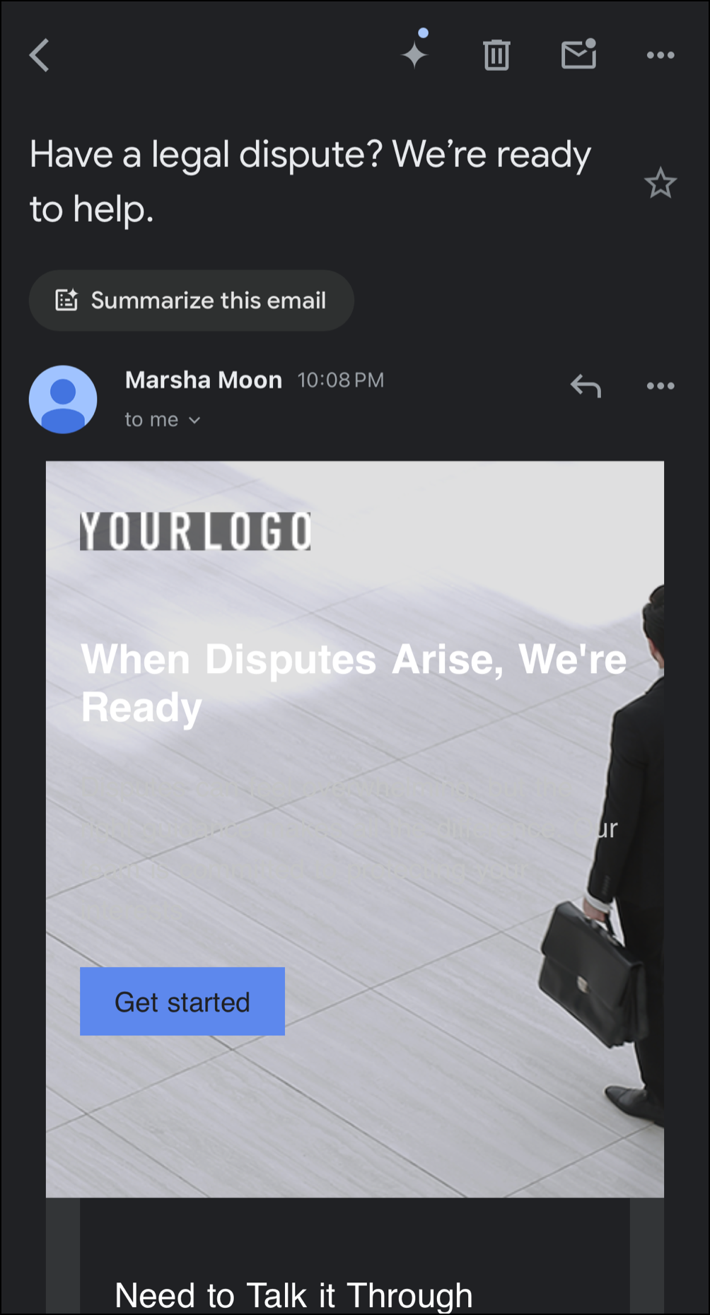
When dark mode is turned on, it can impact the look of an email in one of three ways, depending on the email client and whether the email is viewed on a desktop or on a mobile device:
- No color change - background and text will not be impacted
- Partial color invert - light background and text become dark
- Full color invert - light background and text becomes dark, and dark background and text becomes light
Because it's a setting recipients can turn on or off themselves, you can't control its impact on how your emails look. Ultimately, if a recipient chooses to enable dark mode, your emails will appear as they prefer.
Note: Many third-party factors affect how content is displayed in dark mode. We are unable to force the receiving program to display the email with a specific color scheme or to prevent dark mode from being applied. The receiving program determines how to display the email.
| Example of an email in Light Mode in Gmail | Example of an email in Dark Mode in Gmail |
 |  |
Tips for designing emails with dark mode in mind
While you can’t guarantee that your email will look the same across all email clients and modes, there are some best practices you can follow when designing your email to ensure it remains accessible and looks good in both light and dark modes.
Logo and images
- Use transparent PNGs: Import images with transparent backgrounds so they blend seamlessly across theme swaps.
- Add light outlines or glows: Apply a subtle white stroke, drop-shadow, or outer glow around dark logos, icons, and social badges. This keeps dark graphics visible if an email client forcibly turns the background black.
- Keep text out of images: Rely on the email body, rather than embedding text into images. Live text dynamically adapts to contrast settings and remains fully readable for screen readers.
Color and contrast
- Avoid pure black and pure white: Stay away from using #000000 text on #FFFFFF backgrounds (or vice-versa). Extreme contrast can cause harsh eye strain and lead to aggressive auto-inversions in apps like Gmail and Outlook. Opt for dark charcoals (#121212, #1E293B) and soft off-whites (#E2E8F0, #F7F7F7) instead.
- Leverage midtones: Incorporate midtone colors into your palette to maintain visibility regardless of whether an email client uses partial or full color inversion.
- Aim for accessibility: Make sure your text and background colors have a contrast ratio of at least 4.5:1 for normal text and 3:1 for large text to accommodate users with low vision or color blindness. You can validate your ratios with online tools, like WebAIM’s Contrast Checker.
Text and buttons
- Adjust font weights: Light text often appears thinner on dark backgrounds. Avoid thin font weights and opt for medium or bold fonts to improve legibility.
- Use solid color buttons: Use vibrant, solid colors for call-to-action buttons rather than transparent or border-only styles so they stand out in any theme.
- Don't rely on color alone: Pair hyperlink colors with underlines or icons so links remain obvious even if a client shifts your color spectrum.
Test across email clients
Because dark mode behaves differently across email clients, send a test version of your email and preview it in multiple inboxes and devices using dark mode to catch any design issues before sending to your contacts.
 | Did you know? Inbox Preview lets you easily preview your emails in a variety of email clients, including desktop and mobile apps, and even dark mode for mobile devices! |