Creating emails that can be read by those with visual impairments is an important part of ensuring everyone can understand the content. Not only does this promote inclusivity, but it also helps boost engagement! Emails created with our email editor allow screen readers—devices that assist people who are blind or visually impaired with reading text on a computer screen—to recognize and understand its blocks of text. In addition, you can improve your email's visual accessibility by incorporating the following best practices:
Headings
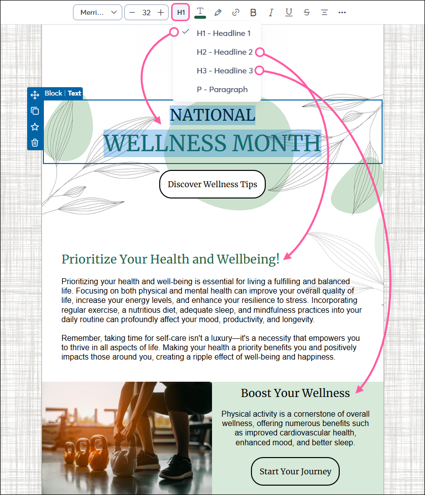
Contacts who use screen readers rely on page elements like headers to determine the structure of your email, “jumping” from heading to heading to understand the content hierarchy. Organize the content in your email by using larger headers, such as the HTML heading attributes <h1> or <h2>, for each section. Within each section, use smaller headers, such as <h3>, to break out content further, if necessary.
- The Golden Rule: Use one H1 per email (usually the main title). Subsequent sections should use H2, and sub-sections should use H3.
- Avoid skipping levels: Never jump from an H1 to an H3. This confuses the logical outline provided to assistive technology.
To create headers within the email editor, highlight the text and use the Headline option in the toolbar to apply the heading style. Do not simply bold and enlarge text, as this does not create the necessary code for a screen reader.
Images
An image description, also known as "alt text," is a message that displays to viewers who cannot see the images in your email. For each image in your email, add descriptive alt text to help screen reader users.
- Informative images: If an image conveys a specific meaning or contains a call to action (e.g., a "Register Now" banner), be sure to enter a clear, descriptive summary in the alt-text field.
- Decorative images: If an image is purely aesthetic (e.g., a visual divider line or accent graphic), leave the alt-text blank. Our editor handles this by adding an empty alt="" attribute to the HTML, which signals screen readers to skip the image, reducing “noise” for the reader.
- Image captions: In addition to alt-text, image captions are highly useful for explaining who is in a photo or elaborating on what's happening in the image, helping contacts who may be using a screen reader.
- Text-in-images: Never put critical information (like dates, pricing, or links) only inside an image. If your recipient has images turned off or blocked, that information is lost.
Meaningful links and readability
Accessibility is also about how easily a human can process your message.
- Descriptive link text: Avoid vague link text like "Click here" or “Read more.” Instead, use descriptive text like "View the Board Meeting Schedule" or "Download the Monthly Report." This allows screen reader users to immediately understand the link's destination when viewing a generated "Links List."
- Avoid all caps: Screen readers can mistake words in all caps as individual acronym letters. For example, "STOP" may be read as "S-T-O-P." Use bolding for emphasis instead.
- Text formatting: For people with dyslexia or low vision, format your text to make it easier to read. For example, use familiar sans serif fonts, include space between sentences and paragraphs, and avoid using excessive italics or underlines.
- Color: High color contrast is essential for contacts with color blindness or visual impairments. Choose a single color for your text and a contrasting, solid background color (maintaining at least a 4.5:1 contrast ratio for standard body text). Avoid light colors on light backgrounds and never use color as the only method to convey meaning; otherwise, the information may be missed entirely.
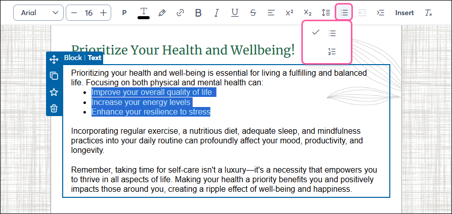
- Bullet points: When creating bulleted or numbered lists, use the list formatting option in the text toolbar at the top of the email editor. Screen readers announce the total number of items in a list, helping the user accurately track their position.
Layout elements
Email technology relies on underlying table structures to ensure messages render correctly across different devices and desktop clients (such as Outlook). However, many third-party accessibility checkers flag "Layout Tables" in email code. While our editor automatically applies indicators to these tables, which tells screen readers to ignore the "table" structure and just read the content itself, you should keep your code as clean as possible.
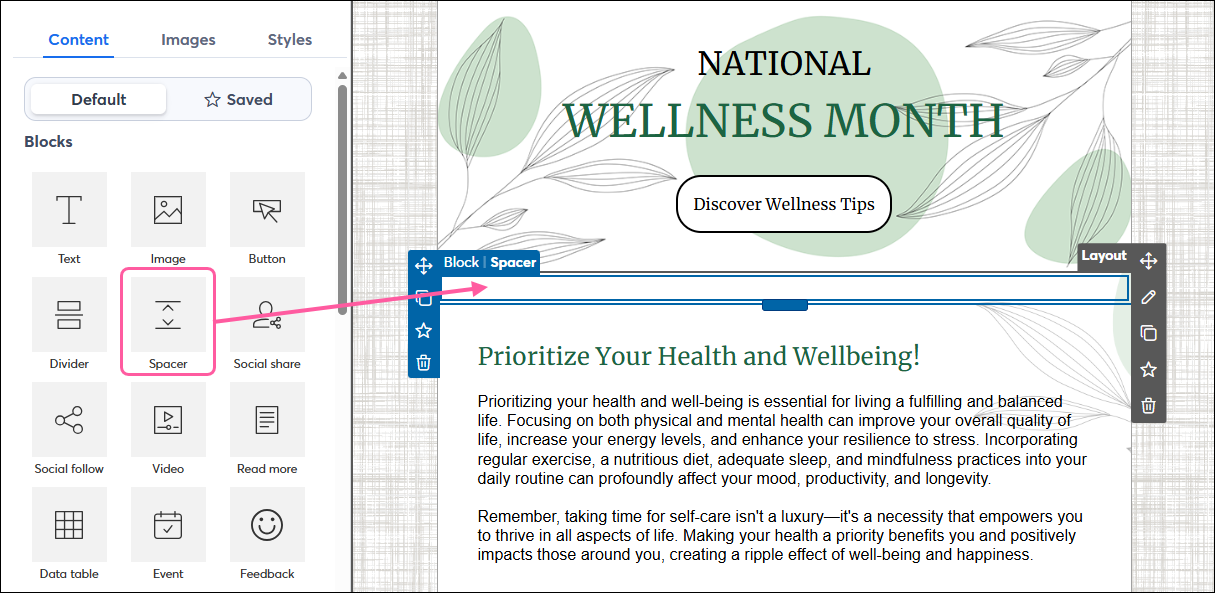
- Spacer blocks vs. hard returns: To create vertical gaps, drag in a Spacer block from the Content tab. Avoid hitting "Enter" repeatedly or using empty Text blocks, as these can trigger extra warnings in accessibility audits.
 | Tip: Before sending to your contacts, be sure to use our Check for Errors tool to catch any broken links or missing alt-text, and use the Preview to see how your content blocks "stack" when viewed on a mobile device, so you can ensure the reading order remains logical on smartphones and tablets. |
Additional Support
If your organization requires a VPAT (Voluntary Product Accessibility Template) to verify platform-wide compliance, please contact our Legal team at legal@constantcontact.com.