We're making it easier to get around Constant Contact with a brand new left navigation. Not all accounts have that change yet, so if your navigation looks different from our articles, that's why–but everything from the top can now be found on the left!

Email and Digital Marketing
How can we help you?
Search our help articles, video tutorials, and quickstart guides

You've got this. You've got us. Search our Knowledge Base to quickly find answers to your questions.

Resize an image in an email for an optimal look on desktop and mobile

Article: 000017769
Updated: March 15, 2024

Manually resize an image or set specific dimensions to ensure it's the right size when viewing on both desktop and mobile

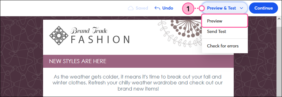
Once you've added an image to your email, you can proportionally increase or decrease the size directly within the email editor. This ensures that the image will be appropriately sized when your email is viewed on a desktop.

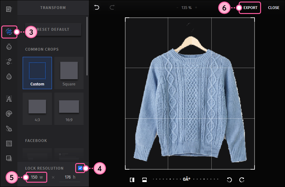
However, this method won't necessarily change how the image displays when viewed on a mobile device. Images that are 480 pixels wide or more will fill the width of the entire screen when viewed on a mobile device. For images you don’t want to span the width of the screen when viewed on a mobile device, you can change the dimensions of the image within the image editor.


Resize an image for optimal display on a desktop

  1. Place your cursor over the image and click the arrows in the lower right-hand corner. Click and drag the corner out to increase the size of the image and in to decrease the size.

    Image Re-size Drag Handle


design tipDesign tip: If you're seeing extra white space above and below your image and you want to get rid of it, you can remove the image padding. The background color of the block can also be changed, giving you additional styling options.


If your image isn't quite looking the way you want, try cropping the image. Wide images work best as banner images because they don't lose as much content when they're cropped.


Set image dimensions for optimal display on a mobile device

  1. Click on the image to open the toolbar, then click Replace.

    Image selected and Replace button
     
  2. Click Edit.

    Insert Image overlay and Edit button
     
  3. Click the Transform icon.
  4. Check the "Lock Resolution" box.
  5. Change the width to something smaller than 480 pixels. Then click the Enter key on your keyboard to automatically update the height.
    Note: Keep in mind that 480 pixels will fill the width of the mobile screen, so choose a width of about 150–250 pixels if you would like the image to take up a third to a half of the width of the mobile screen.
  6. Click Export.

    Image Editor with Lock Resolution checkbox, Set Width Dimensions, and Export button
     
  7. Click Insert.

    Insert Image
     

You'll notice that the size of the image within the email editor hasn't changed, meaning that the image won't appear smaller on a desktop. But, the image will display smaller when viewed on a mobile device. Use the preview feature to make sure the image looks right to you:

  1. Click Preview & Test > Preview.

    Preview & Test dropdown with Preview option
     
  2. Click the Mobile tab.

    Desktop Preview of email and Mobile tab
     

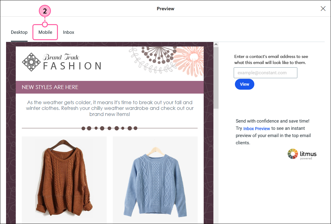
Make sure the image appears the way you want it to when viewed on a mobile device.
 

Preview of Email on Mobile Device 
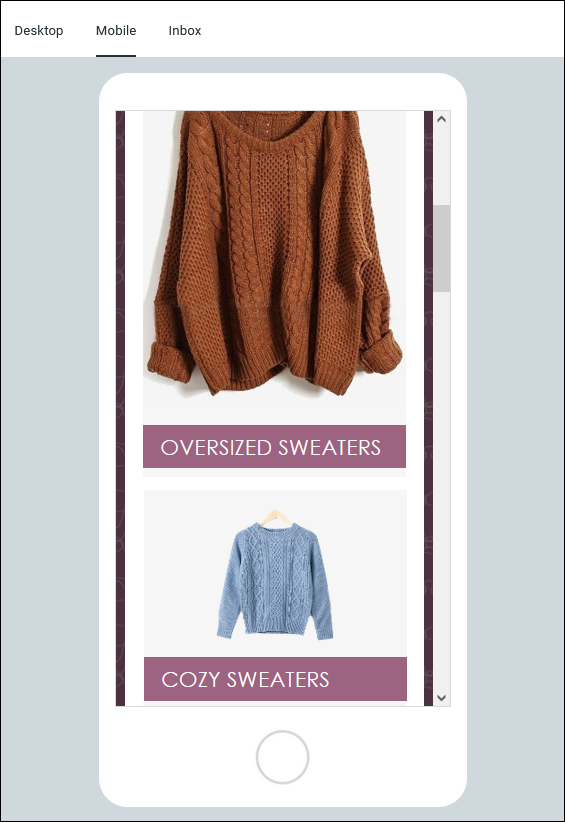
    The dimensions of the top image (the orange sweater) were not changed, and it therefore fills the width of the screen on a mobile device.
 
The dimensions of the bottom image (the blue sweater) were decreased and therefore it appears smaller when viewed on a mobile device.


Questions?

Ask the Community

Did this article answer your question?


Constant Contact Logo

Copyright © 2025 · All Rights Reserved · Constant Contact · Privacy Center