Emails have moved away from being strictly informational; now the goal is to get your contacts to engage with them. By making your email short and including a clear call-to-action, you increase the chances that your contacts will do what you're asking of them while they're reading your email, rather than later.
You know an effective call-to-action when you see it because it makes you act; but how do you make yours just as effective? There's actually a simple formula you can follow that leaves lots of room to experiment with your email design:
When your call-to-action is top-of-mind, and more importantly, easy to do, your contacts are more likely to take action now, rather than add it to their "do later" list and forget all about it. Ideally, your call-to-action appears towards the top of your email. This maximizes the chance it's seen on mobile devices without having to scroll too far. Keeping your email short gives you a little more freedom regarding where you place your call-to-action!
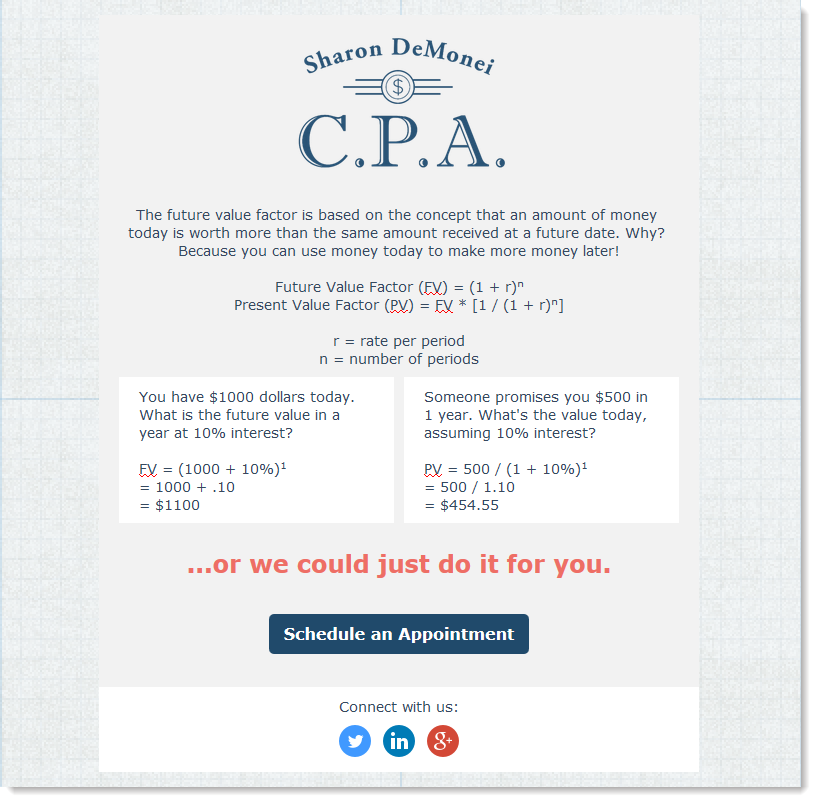 | |
| This email is designed to look like an appointment reminder and the copy is simple and direct. The content is sparse, but evokes the same "oh yeah, I need to do that" feeling you get from seeing an actual appointment reminder card. The contrasting color of the button text makes the call-to-action stand out. | This email is designed with the idea that unless you have lots of time on your hands, you're probably going to skim over a complicated math problem and land on the call-to-action at the bottom of the email. The color of the text helps draw the eye right to the call-to-action, and doesn't detract from the branding. |
A clear call-to-action doesn't necessarily mean a single call-to-action. You have some freedom to make a few related requests. For example:
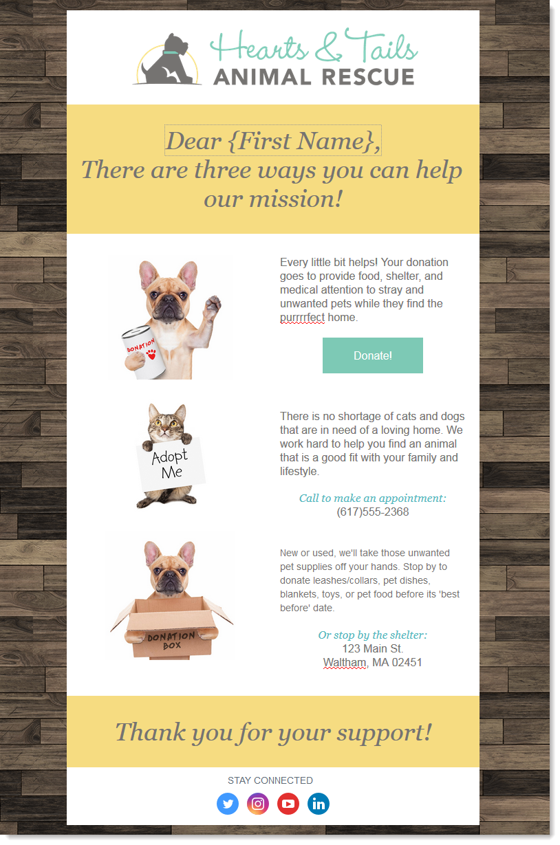 | 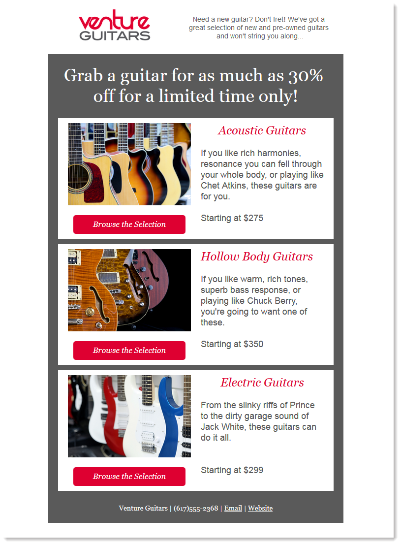 |
| This email from a nonprofit organization highlights all the different ways you can help them with their mission. The mission is the call-to-action, but donors have choices for how they can help. | This email from a retailer has several items for sale. The sale is their call-to-action, but customers have choices for the types of items they're looking for. |
| Design tip: If your email has multiple calls-to-action, setting up click segmentation lets you capture your most engaged contacts on a list of your choosing when they click a link, button, or image in your email. The next time you send, you can create even more targeted content! |
In general, buttons make a stronger call-to-action than a text link because they're visually striking and easy to click. It's not a hard and fast rule, though! Text links may better fit the design of your email. The bottom line is to make the button or link for your main call-to-action stand out from the rest of your content:
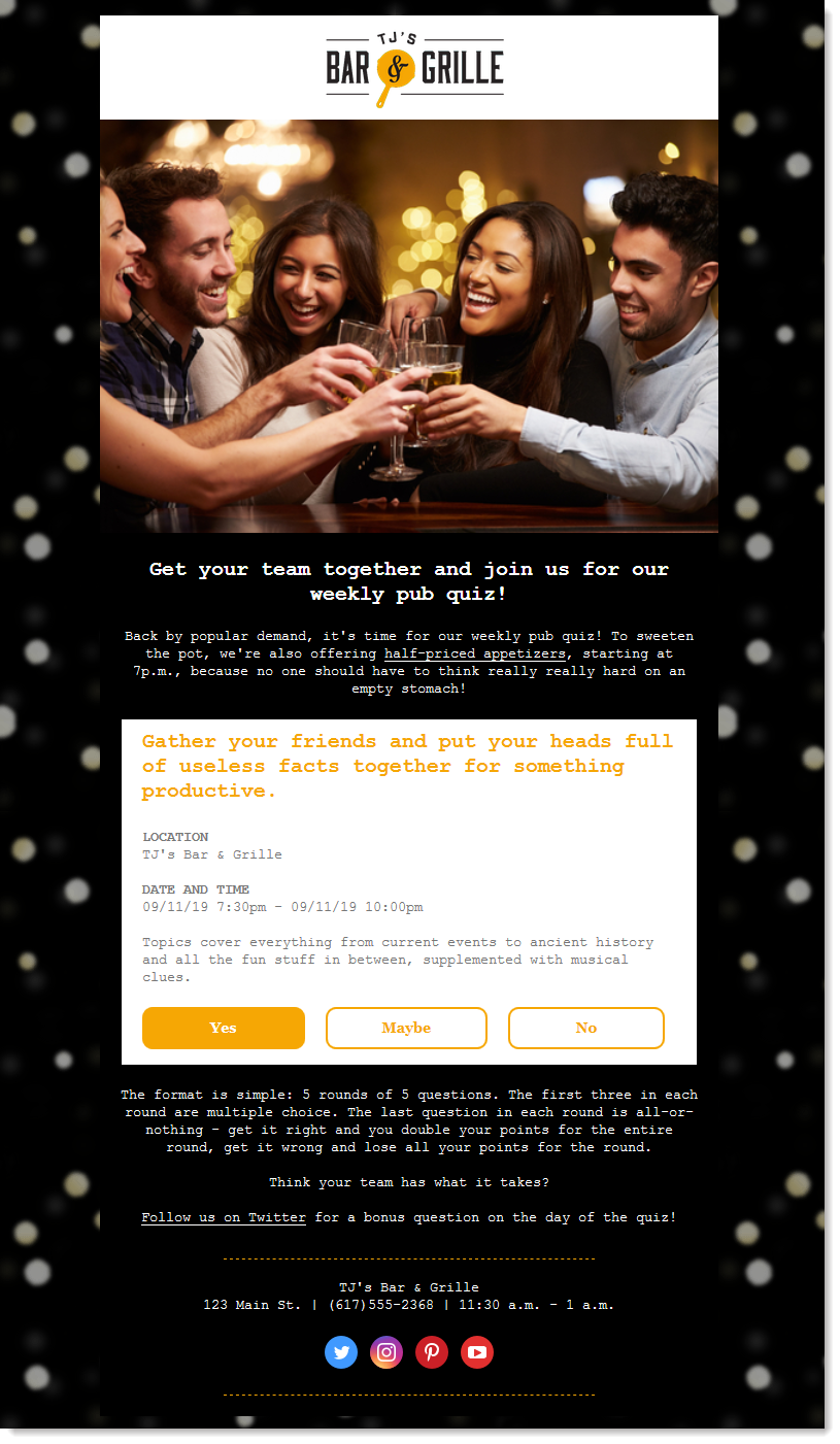 | 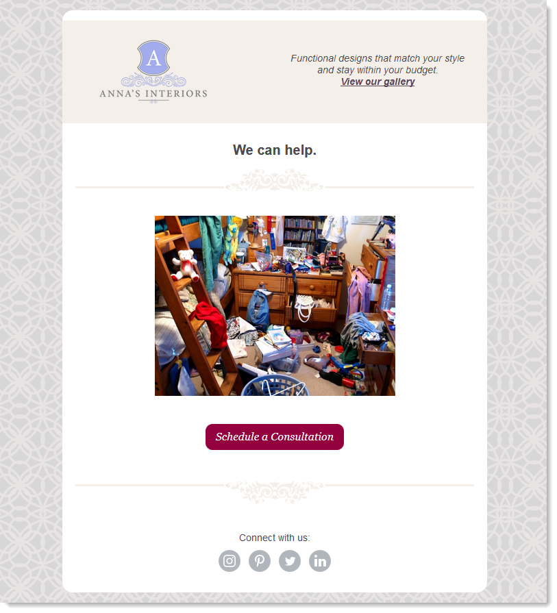 |
| This email has lots of detail because it's promoting an event, but the call-to-action isn't lost—the strong contrast in color lets you get away with a slightly longer email because the eye is drawn right down to the call-to-action. Using an RSVP block takes the guesswork out of giving the buttons the right size and spacing, while still giving control over the color and content. | This email uses an image to make a statement with a minimal amount of text. The button is in a stand-out color that complements the branding and has a good amount of white space around it. The social media icons have been turned to grey-scale so they don't compete with the main button. The supporting link to the gallery is at the top of the email, but in a more subtle color—it doesn't get lost because there is so little content. |
| Design tip: Need some help getting started? Check out our selection of blocks and pre-built layouts to help drive your contacts to take a specific action! |
Your readers are probably conditioned to expect a call-to-action when they open an email, so yours needs to stand out as something special. Your button or link depends on the content of your email to support it; if your content is doing its job, your call-to-action will stand out:
Once you've defined what it is you want your contacts to do and the benefit of doing it, it's time to create the call-to-action.
| Join the conversation: First time designing an email? Our Community can help! Just submit your email to the "Campaign Feedback" forum for some feedback before you send it out to your contacts. |
You've sent your email, but now you need to know how your call-to-action performs. A strong subject line gets the open, a clear call-to-action gets the click, and a clearly defined benefit gets the completed action:
| The data shows: Segmenting your contact list leads to improved email performance. When you aren't trying to cram content for everyone into your email, it gets easier to write, too! |
Any links we provide from non-Constant Contact sites or information about non-Constant Contact products or services are provided as a courtesy and should not be construed as an endorsement by Constant Contact.
Copyright © 2026 · All Rights Reserved · Constant Contact · Privacy Center