A more modernized approach to this would be to display these tables using Flexbox to properly display these elements in their respective columns while allowing them to remain responsive.
Note: If you're using the new email editor HTML code cannot be viewed or modified. You can add HTML layout blocks into your email and modify the HTML code for that block only. Use this multi-column solution in the older editor by opening one of your older, Classic emails and copying or editing that email.
This guide will show you how to address this.
| Administrators | ✓ | |
| Company Managers | ✓ | |
| Marketing Managers | ✓ | |
| Sales Managers | ✓ | |
| Salespersons | ||
| Jr. Salespersons |
 | Tip: Are you looking for information about Constant Contact’s Email and Digital Marketing product? This article is for Constant Contact’s Lead Gen & CRM product. Head on over to the Email and Digital Marketing articles by clicking here. Not sure what the difference is? Read this article. |
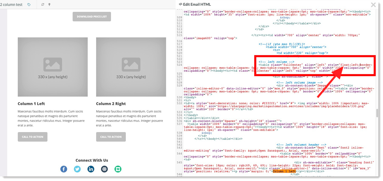
You will need to add the CSS style property float:left; and float:right; to the respective columns. Click on the 3 dots in the top right hand corner and go to ‘view code’. Press CMD + F on Mac or CTRL + F on PC to do a search and search for some text within the left column. You’ll want to find the commented line <!--left column-->. In the inline styles, add float:left;
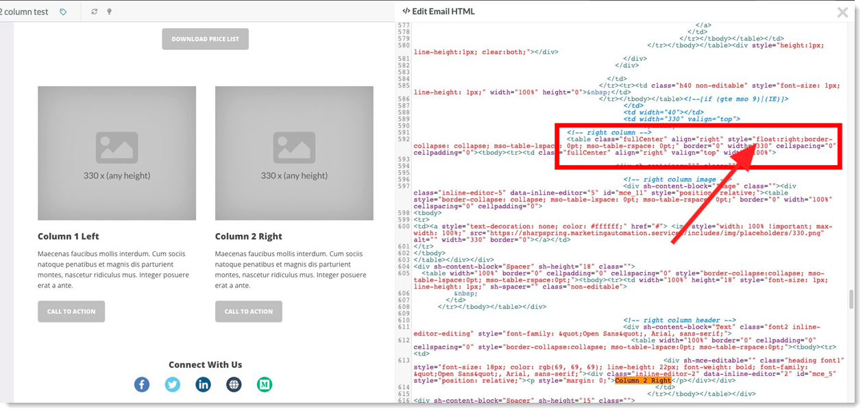
Next, do another search and search for some text in the right column. Find the commented line <!--right column-->. Add float:right to the <table> directly underneath that comment.
You will need to add some CSS to the <head> of the email after the last </style> tag. This CSS will create a small margin in between the columns. This CSS will also make the columns span 100% of the width on screen widths smaller than 800px.
<style>
.flex-container {
display: flex;
flex-direction: row;
flex-flow: row wrap;
}
.flex-item {
flex: 30%;
margin:0px 5px; /* Adds margin horizontally between the columns */
}
@media (max-width: 800px) {

.flex-item {
flex: 100% !important; /* Makes the columns with the class .flex-item span 100% width */
}
}
</style>
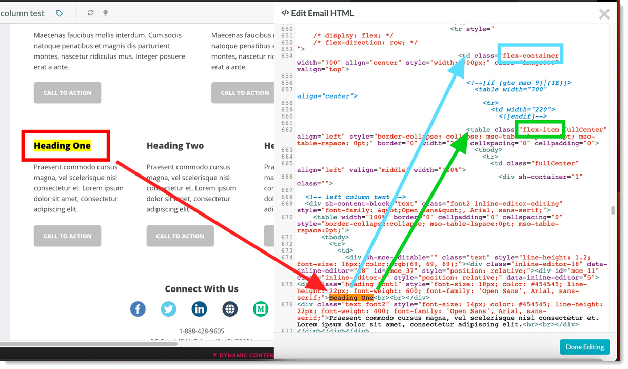
Next, you need to add a class to the parent <td> element and the child <table> elements. There will be 3 of the child <table elements for a 3 column layout.
Blue - Parent <td> element. This element should have the class flex-container.
Green - Child <table> element. This element should have the class flex-item. This will need to all three of the child <table> elements.
Update Parent Element and Left Column Child Element:
Update Center Column Child Element: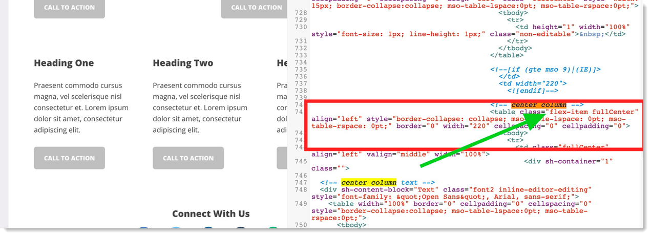
Update Right Column Child Element: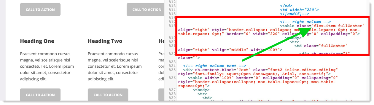
Copyright © 2026 · All Rights Reserved · Constant Contact · Privacy Center