We're making it easier to get around Constant Contact with a brand new left navigation. Not all accounts have that change yet, so if your navigation looks different from our articles, that's why–but everything from the top can now be found on the left!

Email and Digital Marketing
How can we help you?
Search our help articles, video tutorials, and quickstart guides

You've got this. You've got us. Search our Knowledge Base to quickly find answers to your questions.

Make an email easier to read

Article: 000006261
Updated: January 30, 2025

Tips for organizing your email content to make it shorter and easier to scan on mobile devices

In a world that's increasingly using mobile devices, more people will read an email if it's quick to read and easy to scan. Here are some ways to make your email look more inviting to busy readers:


Blue Ribbon IconJoin the conversation: First time designing an email? Our Community can help! Just submit your email to the "Template Feedback" forum for some feedback before you send it out to your contacts.


Keep your email short

Attention spans are short, so get to the point right away:
  • Main point - Figure out the main reason for your email and get rid of extra content that falls outside of it.
  • Call-to-action - Focus on a single call-to-action and make it the main attraction. Giving your reader too much to do gives your reader an excuse to send it to the "I'll get to it later" folder instead of acting immediately.
  • Deliberate images - Don't add images for the sake of having them. If your images don't support your content or help your email look balanced, get rid of them.
  • Sparse text - Keep your paragraphs short and leave white space between them to give your readers' eyes a break. Stick to about 20 lines of text or less in the entire email. It may not seem like much, but with text wrapping around images, columns, and other design elements, 20 lines of text can go further than you think!
  • Link-off - Use a Read More block to give your readers a quick taste of the full content that lives elsewhere on your website or blog. There's no need to reinvent the wheel in your email.
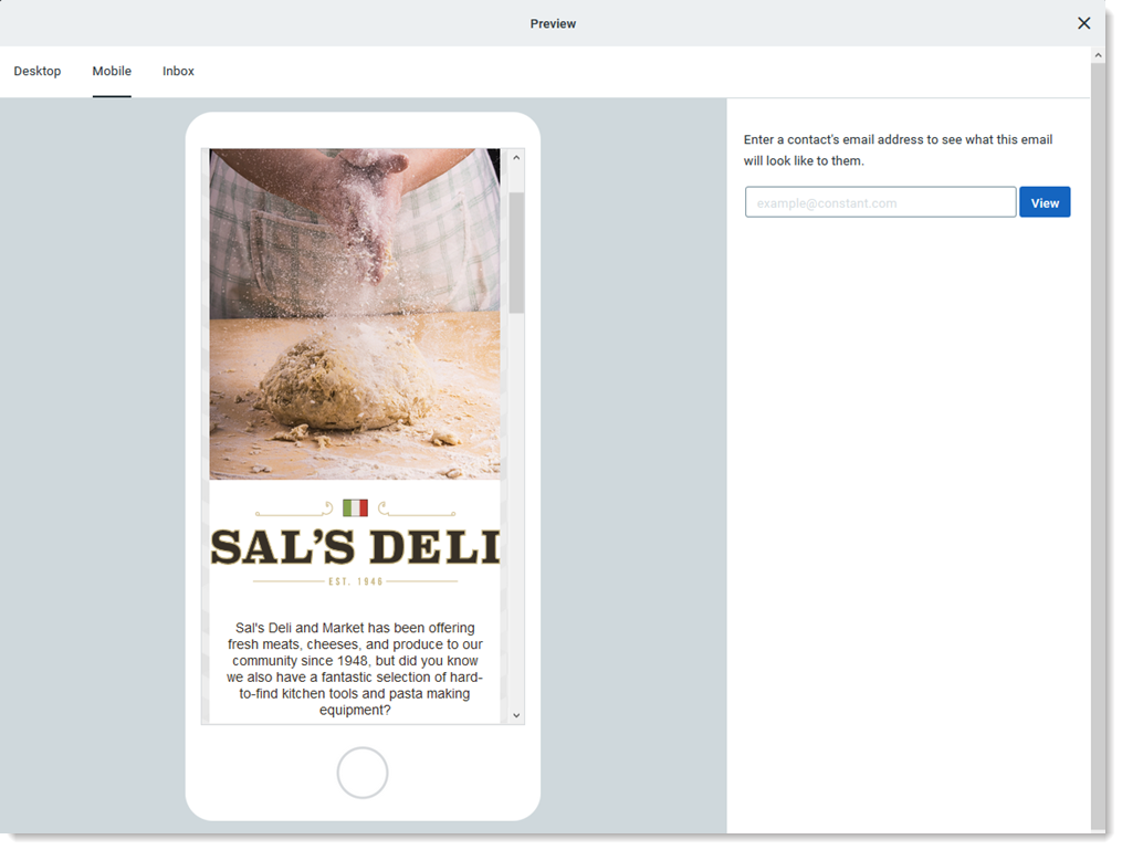
  • Preview and test - As short as your email is, it's even longer on a mobile device! Use the mobile preview and then send a test version of your email to a second set of eyes and ask them for suggestions for making it more concise.

    Desktop and Mobile Preview Toggle


Catch your readers' attention

Keeping your content simple helps to draw attention to your main points or call-to-action items; a little styling doesn't hurt either:
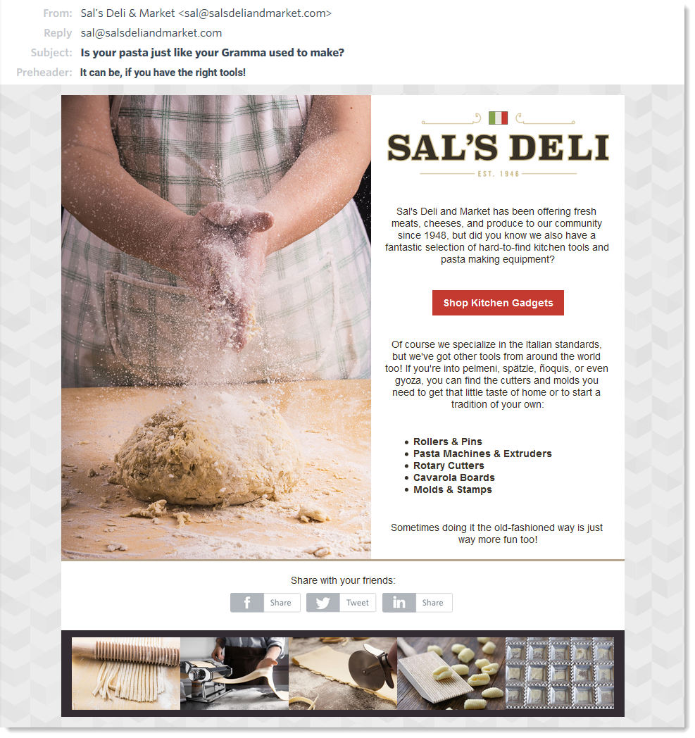
  • Subject line - Make good use of your email header and preheader to make your audience immediately understand what they can expect from it before they open it.
  • Call-to-action - Include a call-to-action in an active voice to entice your readers to take immediate action. For extra visual interest, consider using a button for your call-to-action instead of a standard text link.
  • Branding - Make your branding consistent throughout your email. Stick to five colors or less to keep your email looking professional and organized. Choose font and link colors that clearly stand out against the background color. Social media icons and social sharing buttons can be styled to blend in or stand out too!
  • Text formatting - Use headline blocks to make your headlines and sub-headings stand out against standard text and stick to four font styles or less to make your text emphasis count. If you're using dark text on a light background or using an ornate font, give a little extra spacing between the lines of text. If you're using light text on a dark background or created a headline, keep the spacing a bit tighter. Learn how to format and style text in an email.
  • Images - Insert images that are relevant to your content, and make them work double-duty by turning them into clickable images. The right image makes all the difference, so use our image editing tools to accentuate your subject and check out our stock image gallery if you're having trouble finding the perfect image. You can even use animated GIFs!

    Email example with header, branding, and formatting


Be easy on the eyes

When people scan an email, they're looking for the content they find the most relevant. Make it super easy with a few design principles:
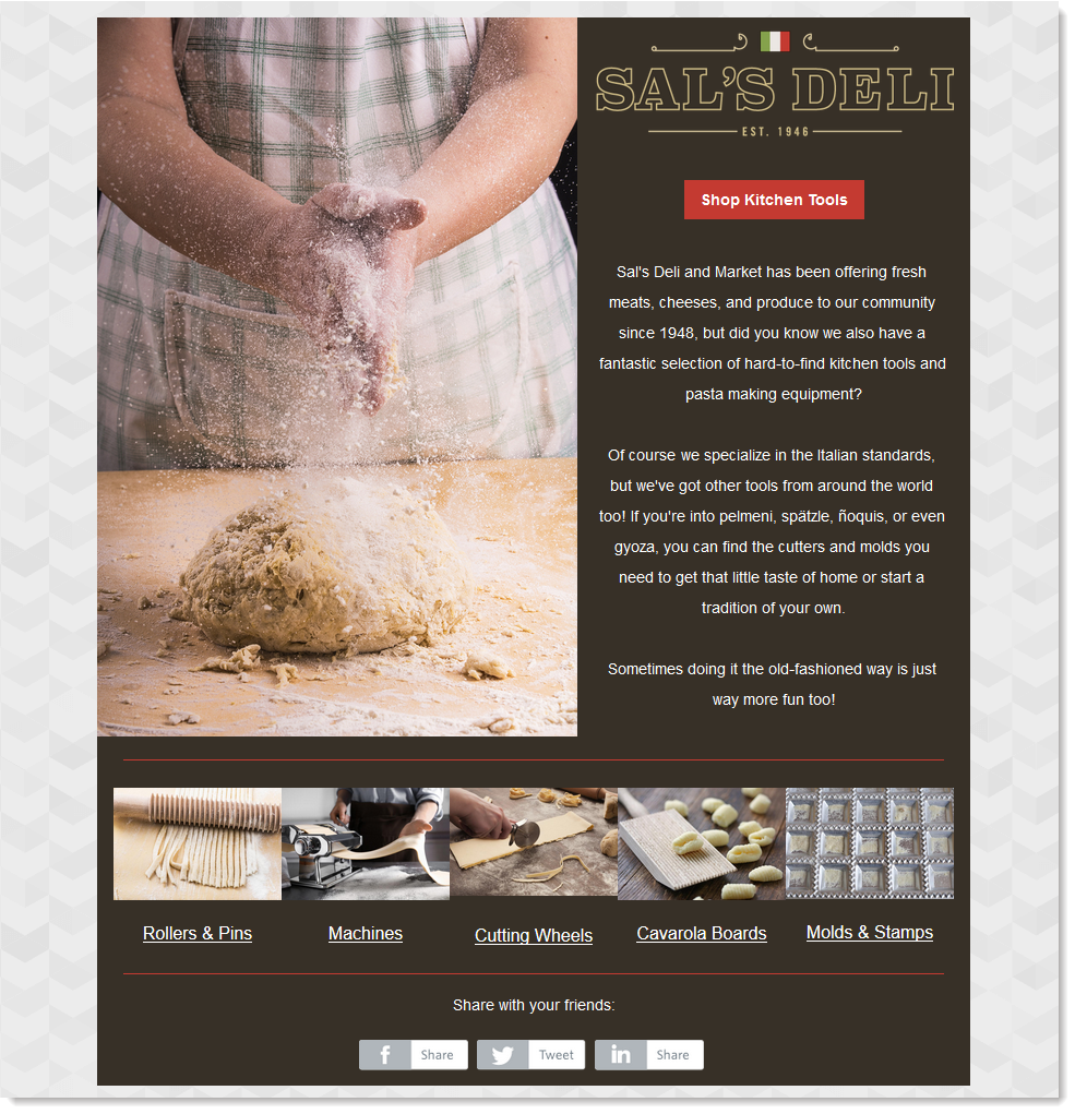
  • Font choices - Be consistent with your fonts. For the cleanest look, stick to the same font style and use different sizes and emphasis (bold, italics, etc...), but if you want to use multiple fonts, create a pattern that's easy to pick out. For example, use the same font style on all of your buttons and use a different font style on all your headlines. 
  • Lists - Use bulleted or numbered lists to draw the eye and get rid of extra descriptive text. Lists help shorten your email too!
  • Dividers - Insert dividers to clearly define each section in your email. This doesn't mean you can't be subtle, especially if you're repeating your formatting through your email. Using a divider color a few shades away from the background doesn't compete with the main content and still manages to boldly define the space.
  • Spacers - Increase white space between sections by inserting spacers. The extra padding tells the eye when to stop and where to start again.
  • Colors - Opt for colors that have good contrast; when bold colors are too similar, they fight for attention and tire the eye. When subtle colors are too similar, they blend together and get overlooked. There are online tools, like WebAim and Contrast Checker, that can help you determine if you've got enough color contrast. 
  • Text-to-image ratio - A good rule of thumb is to have at least one image for every 20 lines of text in your email. If you have lots of text, the images will tell your readers what's relevant and what they can skip over — we read from left to right, so place the image on the left-hand side of the text for maximum efficiency.
  • Call-to-action - Make your main call-to-action dominant and put your secondary buttons and links into the background. An easy way to do this is with a less dominant color or a smaller font size. Buttons can sometimes compete with images, but if you add some text in between, the buttons stand out more.

    Email Example with Light Text on a Dark Background


Any links we provide from non-Constant Contact sites or information about non-Constant Contact products or services are provided as a courtesy and should not be construed as an endorsement by Constant Contact.


Paint brush iconBored with your usual email templates? Change it up with an animated template! Our team of experts brings emails to life using image animations. Get yourself an animated template today!


Questions?

Ask the Community

Did this article answer your question?


Constant Contact Logo

Copyright © 2025 · All Rights Reserved · Constant Contact · Privacy Center