How do you tell if an image is losing its impact? Just count them! Emails with more than three images, not including your logo or social media icons, see much lower click rates. But what do you do with those images once you've narrowed your selection? Where do you place them? Check out the ideas below.
| Be a better marketer: Want to learn more about optimizing the images in your email? Check out How to Use Impactful Images in Your Email Marketing. |
You'll know when your image is in the right spot because it looks balanced. Staggering your pictures or putting a single image front and center can dramatically alter how an email feels. Remember, white space is your friend. Use it to guide the eye from one thing to the next.
 Channel
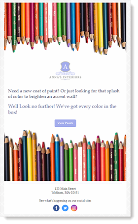
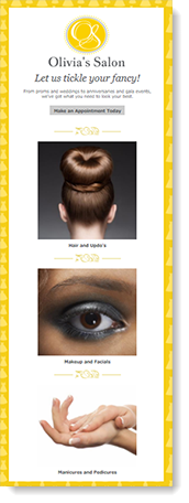
Use images like a margin by placing two of them on opposite sides of the page. Despite being colorful and showy, these are not the focus. All that empty white space in the middle of the page draws the eye instead. Learn more. |
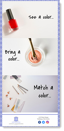 Zig-zag
By alternating the position of the photo's subject matter and blank spots, you can create a left, right, left rotation. All that's left is to fill in the blanks with text. Learn more. |
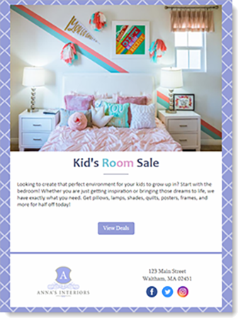 Inverted pyramid
Think of your page as an upside-down triangle. Use a full-width image at the top of the page — the widest part of the pyramid. As you move down, past the title and other text, you are being funneled straight to the tip of the triangle: the call-to-action. Learn more. |
| Design tip: Build your email to focus around a single call-to-action. That way there's no hesitation, no confusion. Just one click. |
After you've decided where an image belongs in your email, it's time to enhance it. Is the subject out of focus? Sharpen it. Not the right color? Adjust the settings or add a filter. With several editing tools at your disposal, a better image is only a click away.
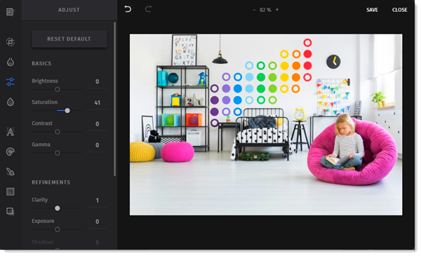 Adjust |
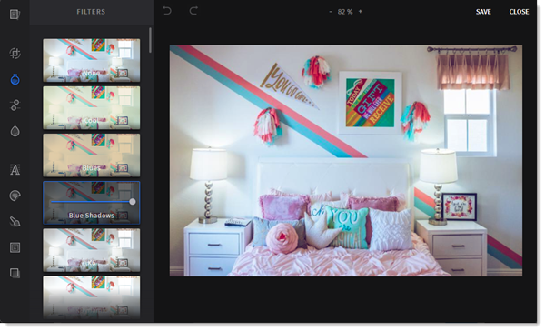 Filters
| |
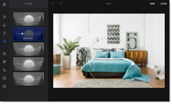 Focus
|
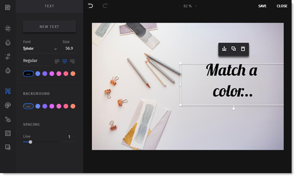 Text
|
| Design tip: Previewing the mobile version ensures that it looks great no matter what type of computer or device it's being viewed on. |
You've heard it before, "A picture is worth a thousand words." Or in this case, a picture is worth around fifty. Wrapping text around your images maximizes their visual impact. Your photos and text should be in harmony, not leaning too far one way or another. Image-heavy emails can sometimes trigger spam filters.
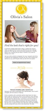
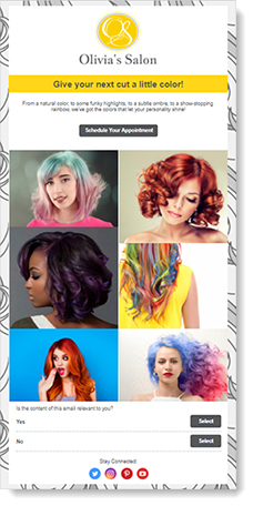 Too many images Hair and makeup is a highly visual field. So, of course, you are going to want to showcase the latest fashions. Using this many images, however, significantly reduces the chances of someone reaching the call-to-action at the end of the page.
|
 Too much text You put a lot of time and effort into your copy so that people will read it. The problem with an email like this, though, is that there is just so much! Nobody has the time to read it all.
|
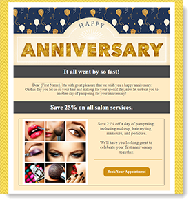
 Just right Nothing distracts from the purpose of this email. A reader can key in on the content that's there, not spend too much time on it, then follow through by clicking the call-to-action. And because the button is right at the top, readers can choose to ignore the content and just jump in.
|
| Design tip: Fifty words to one image isn't a hard-and-fast rule. Sometimes, all an image needs is a sentence for context. Learn more. |
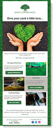
Most email backgrounds are white. Flat, dull, boring white. So let's breathe some life back into those templates! Adding a background layer creates the illusion of depth, as if several pages are resting atop each other. Use it to draw attention to a specific action block, differentiating it from the rest of the email.
 |  |  |
| Design tip: Making your background color match your brand helps the emphasis seem natural. Or, if in doubt, just use gray. |
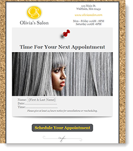
 What's the purpose of this email? |
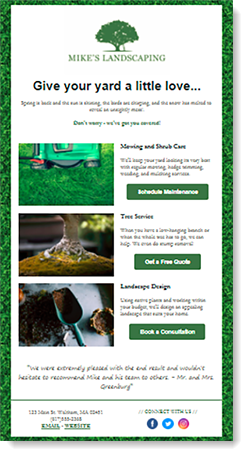 What's the purpose now? |
| Design tip: Make your logo and images clickable for further exploration and discovery. |
Copyright © 2026 · All Rights Reserved · Constant Contact · Privacy Center